Graphic Inc. is a New York based publisher of design focused books and awards for the visual communications industry. The Graphis awards recognizes and promotes the best submitted work across graphic design, advertising, photography, poster design, branding, typeface design, logo design and illustration. The award competitions are juried by award-winning leading creatives, including Graphic Design, Advertising, Photography, Posters, New Talent (Student), Packaging and Protest Posters. The award-winning work is published online and in fine art quality hardbound books.
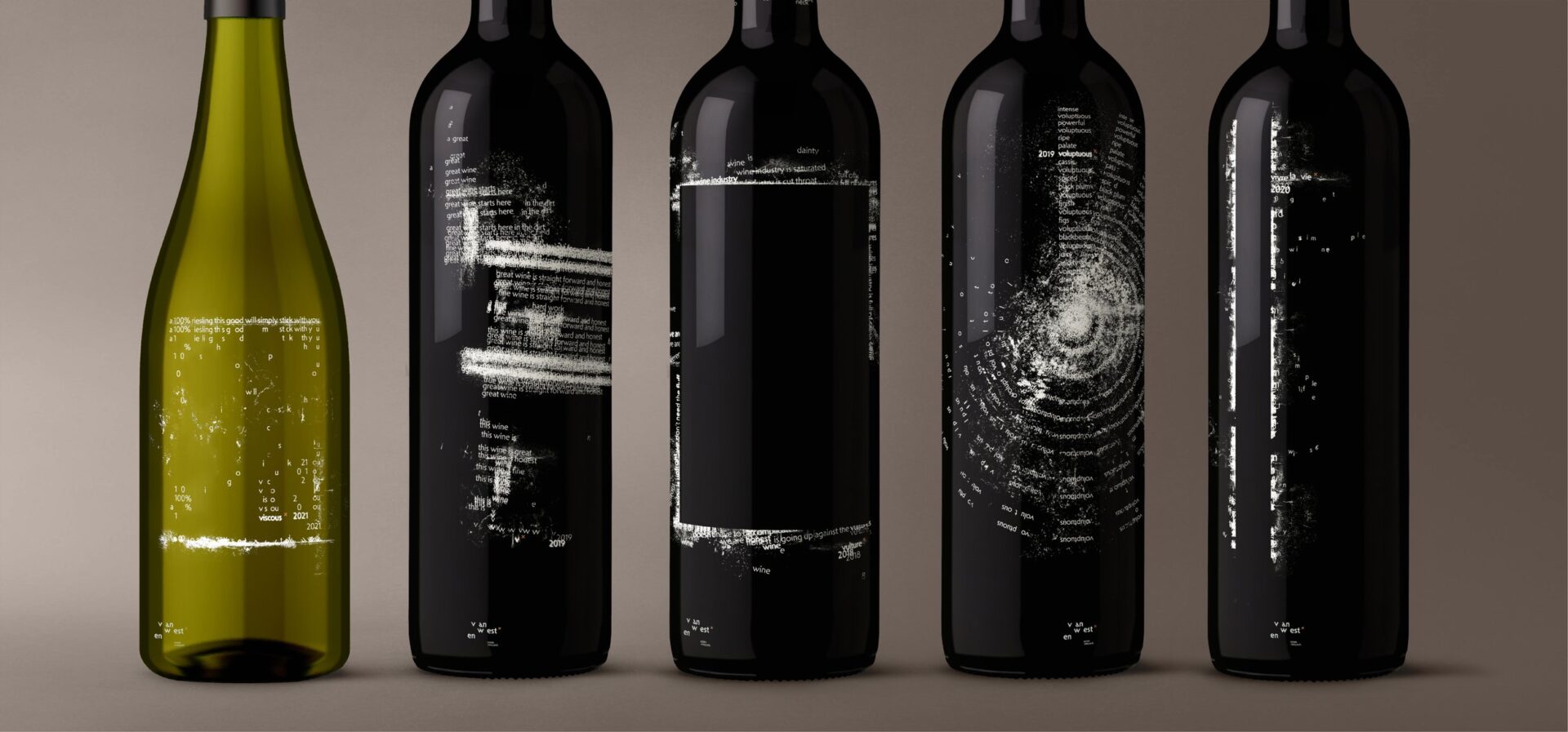
Fourth year Graphic Design for Marketing student Cali Martin’s re-branding work for Van Westen winery, located in the Okanagan has received 3 honourable mentions. Her work on an exhibit focused on Canada’s residential school history was also recognized.
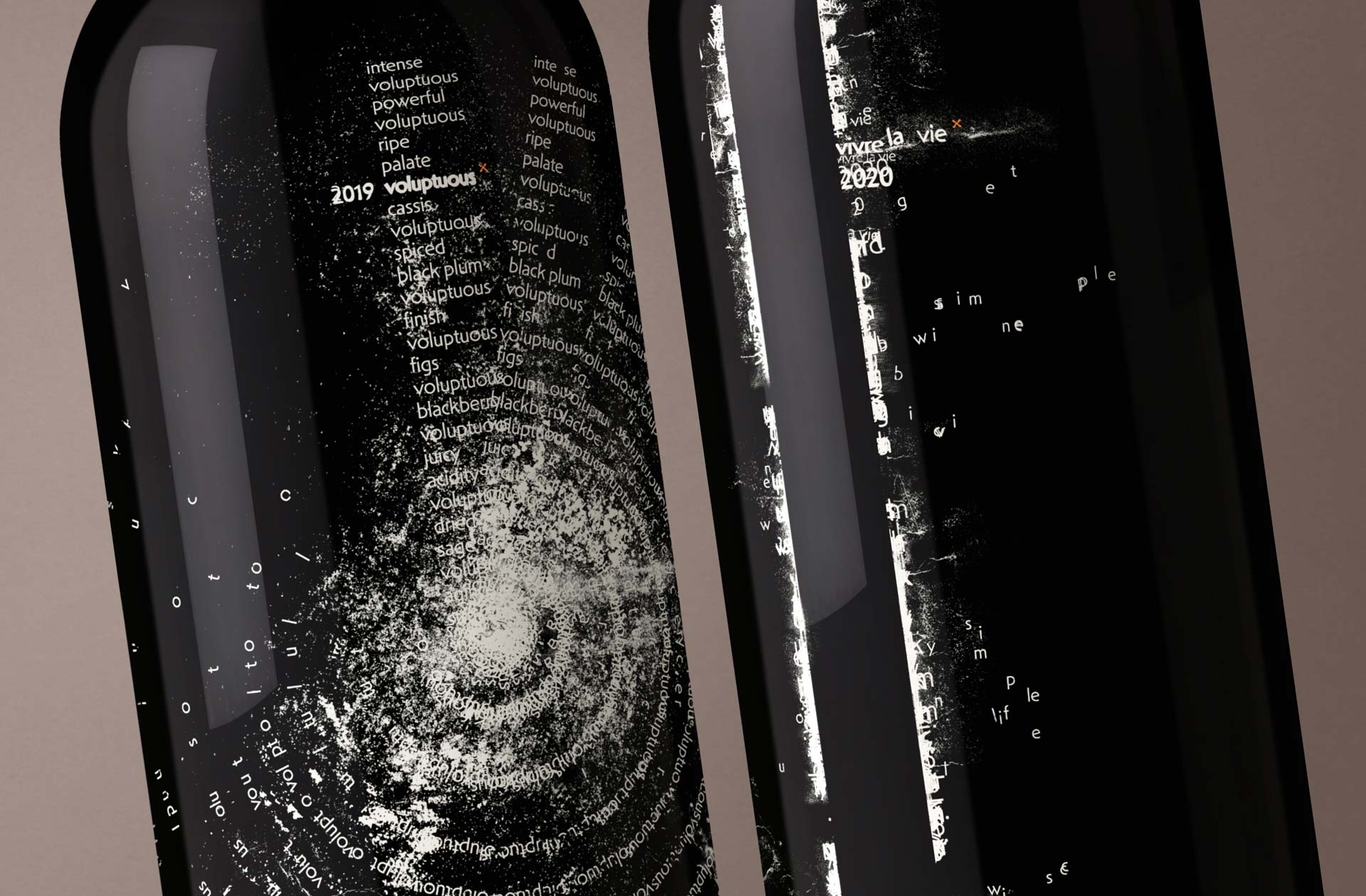
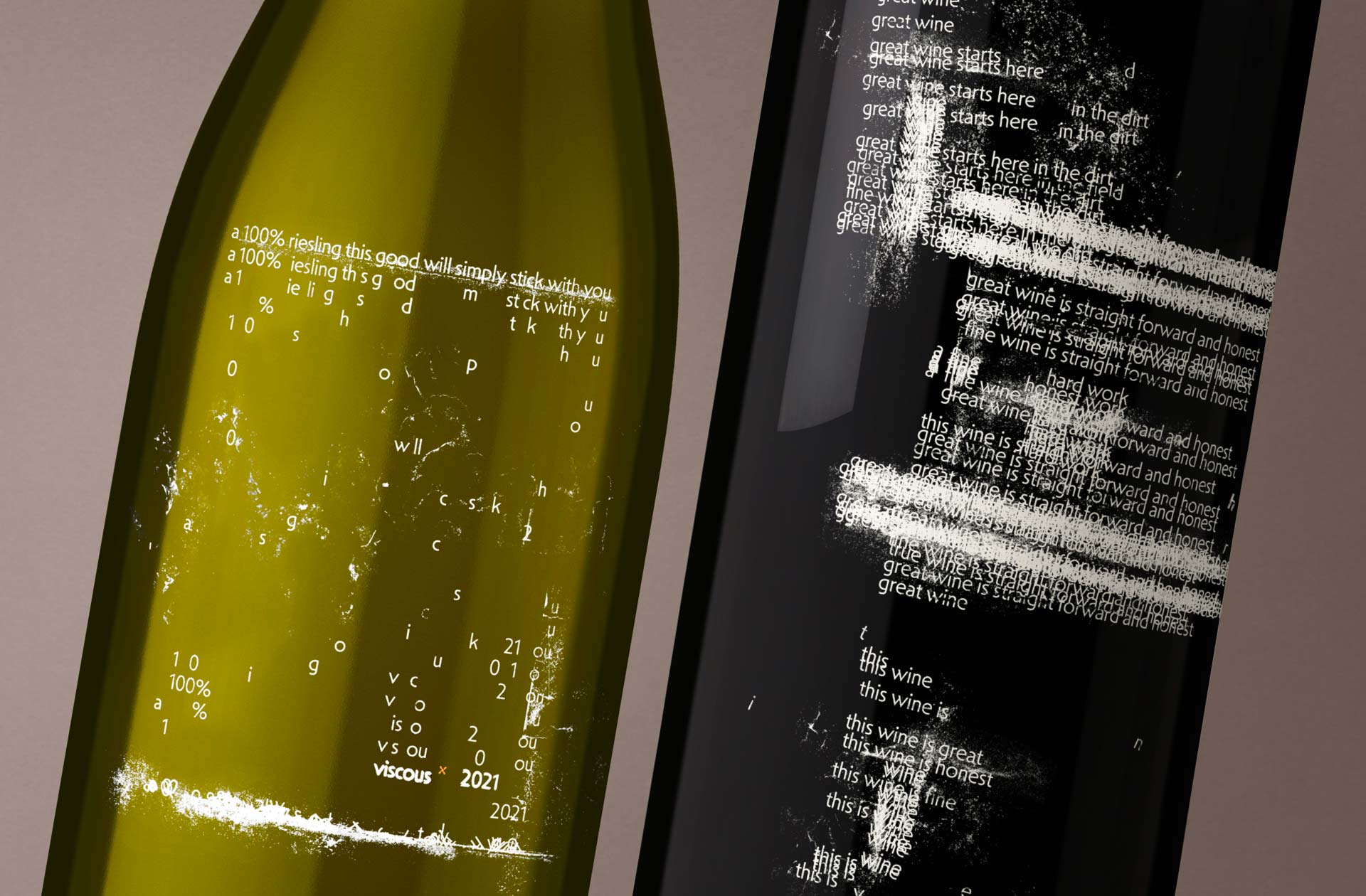
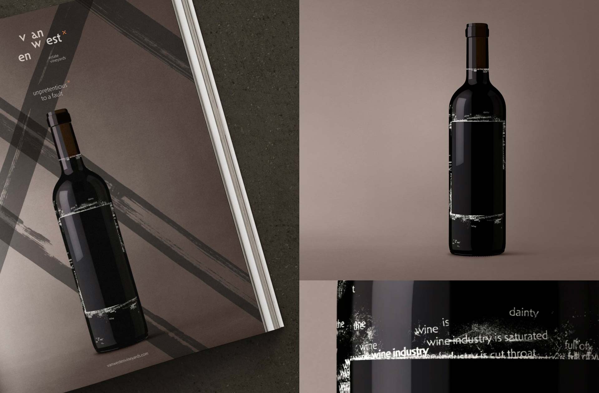
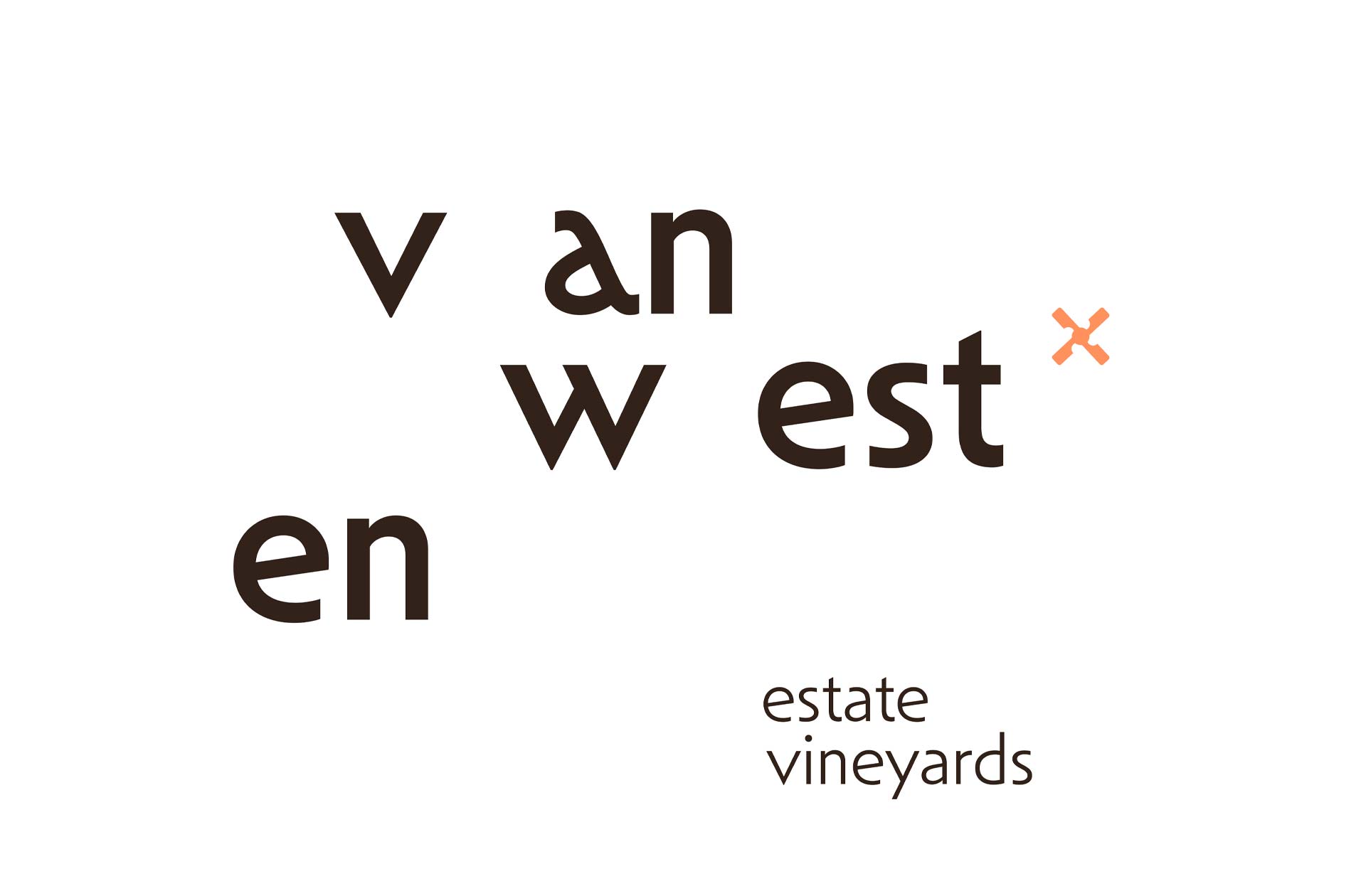
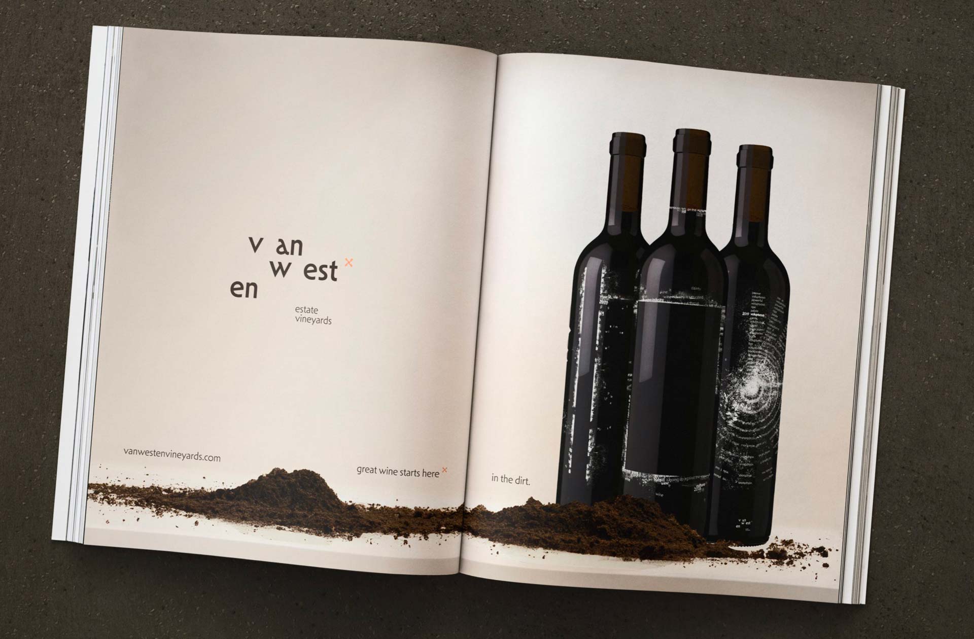
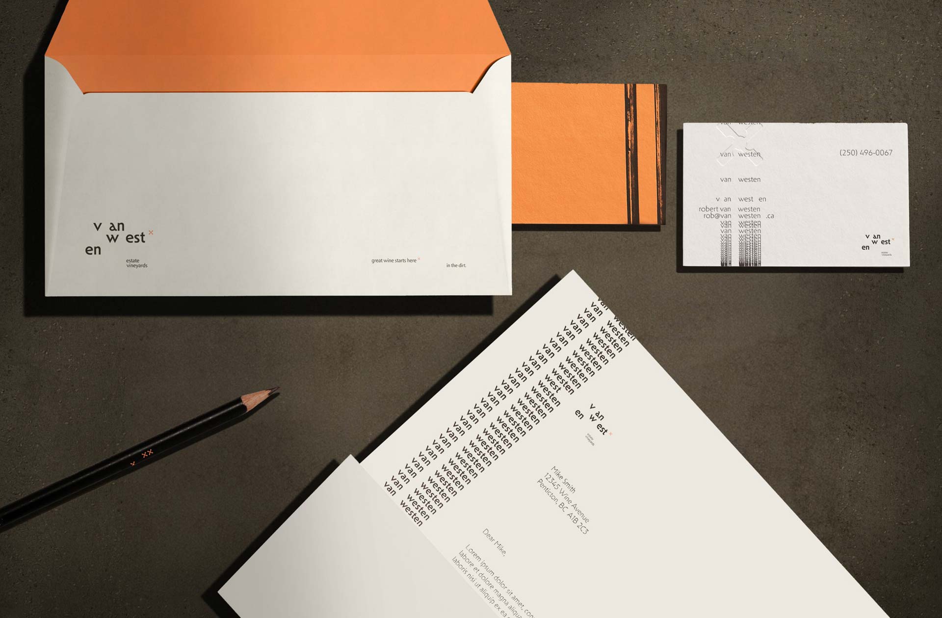
Celebrating their roots, the Van Westen identity embraces modern hints to Dutch typography with nuanced letterforms, as a subtle rebellion against conventional luxury. The deliberate separation of letters entices a second look, prompting curiosity about the family name.
As Cali shares in her design rationale: The Van Westen packaging family is a celebration of the winery’s roots with a rebellious spirit against conventional luxury. Embracing modern Dutch typography with deliberately spaced letterforms, the design system lends itself to enticing a second look and kindling curiosity to dig deeper.
Each Van Westen label displays a unique composition that combines typography, rhythm and art. The compositions take inspiration from the essence of each blend, creating labels worth taking a closer look at. Their commitment to an unfiltered journey from grape to glass strips away the fluff, resulting in bottles that are a statement piece of their own.
The creative challenge was to assess the given client’s current context and identify issues surrounding their brand, positioning, assets, and competition. We were then tasked to present a new identity that is an improvement and better serves the client, along with a graphics standards manual and supporting assets.
Van Westen Estate Vineyards, rooted in over 50 years of family tradition on the Naramata Bench, has evolved from being the largest cherry producers in the area into crafting exceptional wines in British Columbia, Canada. The quality speaks for itself, earning themselves numerous awards and selling out effortlessly.
Recognizing the charm inherent in their upfront and casual nature, the brand strategy needed a shift – maintaining their rugged authenticity but with an elevated touch.
The “daisymill” icon featured is a reference back to Dutch windmills, embodying resilience and innovation with the daisy at its core as Netherlands’ national flower, speaking to strength in the unassuming – a fitting symbol for a winery that thrives on the unexpected intersections of humility and the pursuit of becoming an award-winning winery in the heart of BC’s wine country.
To see Cali’s full project on her website click here.
To see Cali’s Residential School project on her website click here.
RECOGNITION
2024 Dieline Awards
Concept, 1st Place – Wine & Champagne
2024 Pentawards
Student Concept, Luxury Goods — Shortlist
2024 Communication Arts
Design Competition, Student Work — Shortlist
2024 Core 77 Design Awards
Packaging, Student Notable
2024 Graphis New Talent
Logo Design — Honourable Mention
2024 Graphis New Talent
Branding — Honourable Mention
2024 Graphis New Talent
Packaging — Honourable Mention
2024 DesCan Salazar Awards
Print Design — Honourable Mention