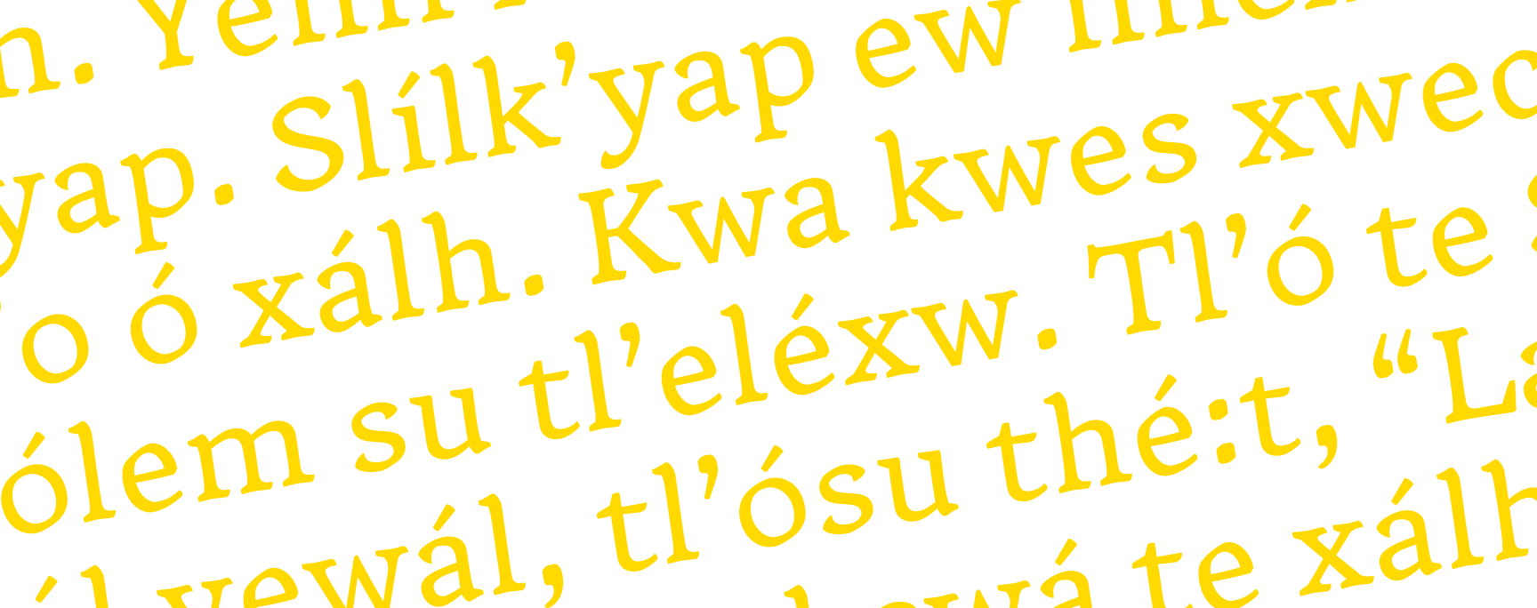
Thresher is a warm, text-friendly serif shaped by embracing imperfection, as well as the attitude and tactility of low-tech farming. With moderate contrast and open proportions, it’s built for clear editorial reading (such as magazines, menus, and cookbooks). Drawing inspiration from agricultural journals and hand-crafted produce signs, it blends utility with storytelling to foster typographic connection, and it has been purposefully designed to anticipate the addition of First Nations language support.
PURPOSE
Expanding typefaces to support First Nations languages in the Pacific Northwest and British Columbia is essential for cultural visibility, linguistic revitalization, and equitable design. Many of these languages are primarily oral and each community is responsible for developing its own orthography. As a result, glyph sets and spelling systems can vary widely across the region, and some communities are further along in formalizing their writing systems than others.
This lack of typographic infrastructure creates barriers to producing accurate educational materials, documentation, and digital resources. It also affects cultural sovereignty: communities need reliable tools to teach, preserve, and share their languages in written form.
The urgency is heightened by the fact that many Indigenous languages in the region are endangered and at risk of disappearing forever without strong revitalization efforts. For example, Halq̓eméylem is classified as “Severely Endangered” by the UNESCO Atlas of the World’s Languages in Danger.
Expanding language support helps address these systemic gaps. It enables communities to express their languages with clarity and dignity and supports reconciliation by ensuring that design tools include (and not limit) Indigenous communication.
Engaging in the practice of inclusive type design is both practical and respectful. Each language community is unique, and designing for their languages affirms the knowledge they hold belongs in contemporary print and digital spaces.
PROCESS
Letterforms were inspired by imperfection, embracing the hand-crafted, lived-in quality of vernacular typography. Thresher features medium contrast, solid serifs, slightly flared stems, and a subtle 2.75° slant to give it an organic, tactile character.


Type design is a highly iterative process. Each glyph went through multiple rounds of revision and adjustment until the optimum form was reached, and all the elements aligned with each other.
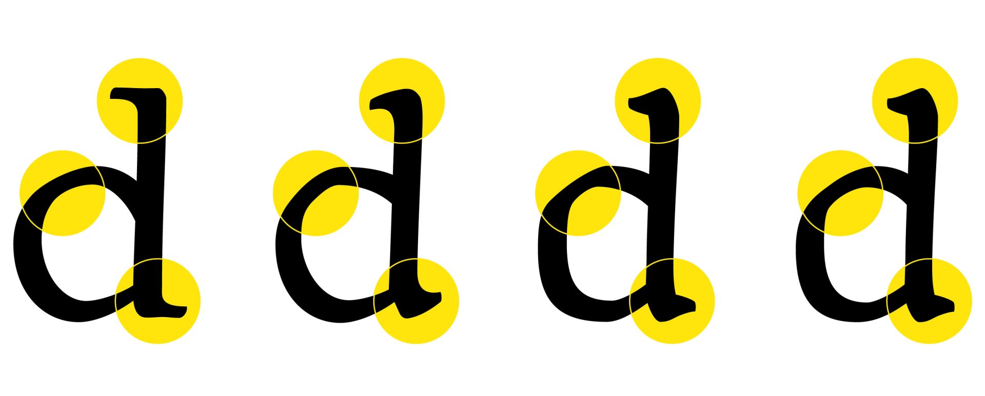
Subtle adjustments to the drawings throughout the process refined the quality of the letterforms to evolve from quirky hand-drawn shapes to unified letter forms.

GLYPHS
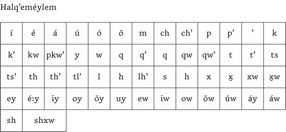
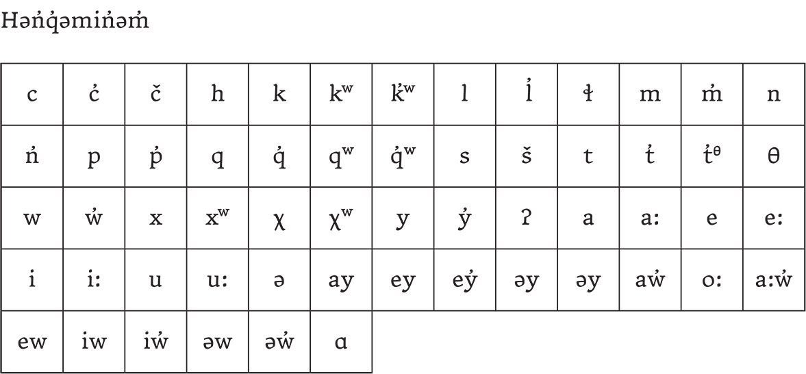
The full set of glyphs is available for free to download and view
DESIGN INFORMATION
Thresher is being distributed for free under an open-source license, with the hope that it will see wide use, particularly for Indigenous text. The project is still a work in progress, so check back for updates, including upcoming Bold and Italic styles.
EULA (End User License Agreement) – Thresher utilizes The SIL Open Font License https://openfontlicense.org/ see below
This End User Licence Agreement (“Agreement”) is a legal contract between you (“User”) and the copyright holder (“Licensor”) for the Thresher typeface and its associated font files (“Font”). By downloading, installing, or using the Font, you agree to the terms of this Agreement.
If you do not agree to these terms, do not install, access, or use the Font.

Matt Heximer is a Vancouver-based designer & educator with over three decades of experience in branding, storytelling, and typographic communication. Matt is currently a faculty member in the Graphic Design for Marketing program at Kwantlen Polytechnic University’s Wilson School of Design, where he teaches strategic Marketing Communication Design.