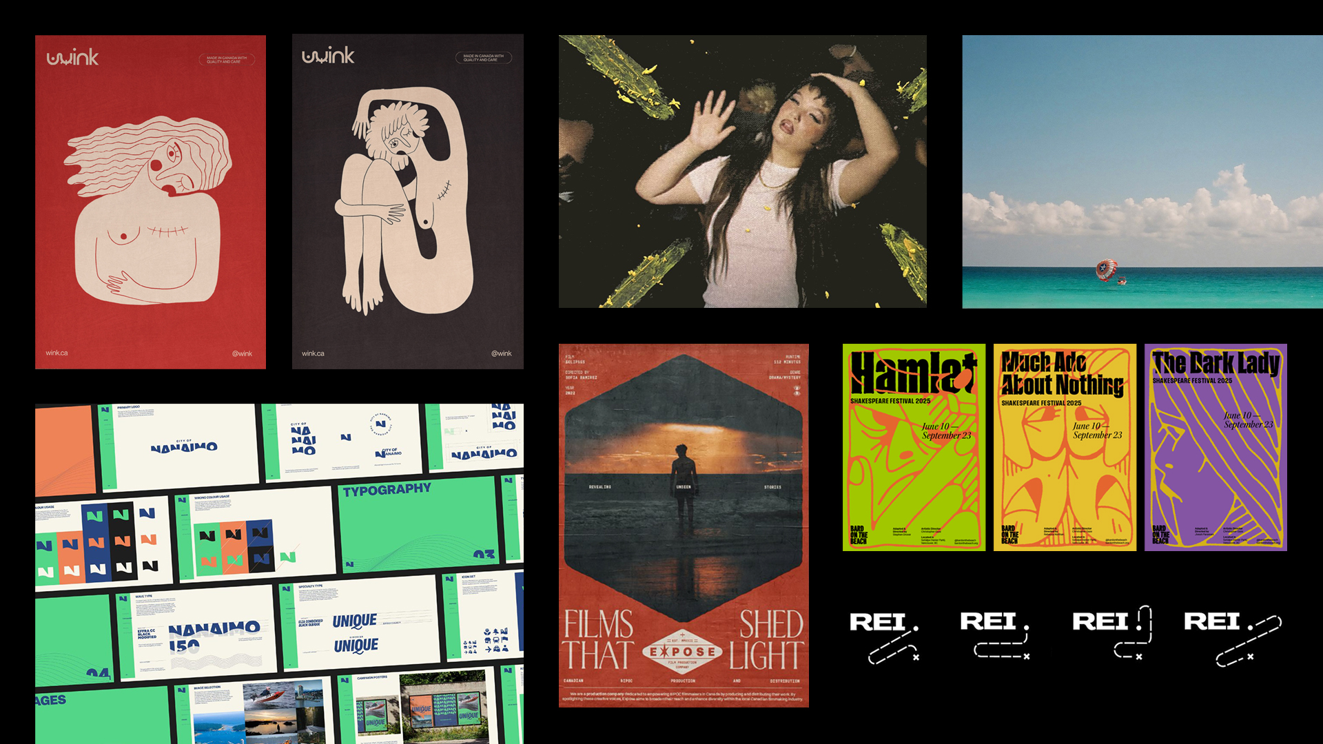
The Wilson School of Design is thrilled to showcase Cali Martin, a 2024 graduate of the Graphic Design for Marketing program, who has won the 2024 Pentawards Silver Award for her rebranding project for Van Westen Estate Vineyards.
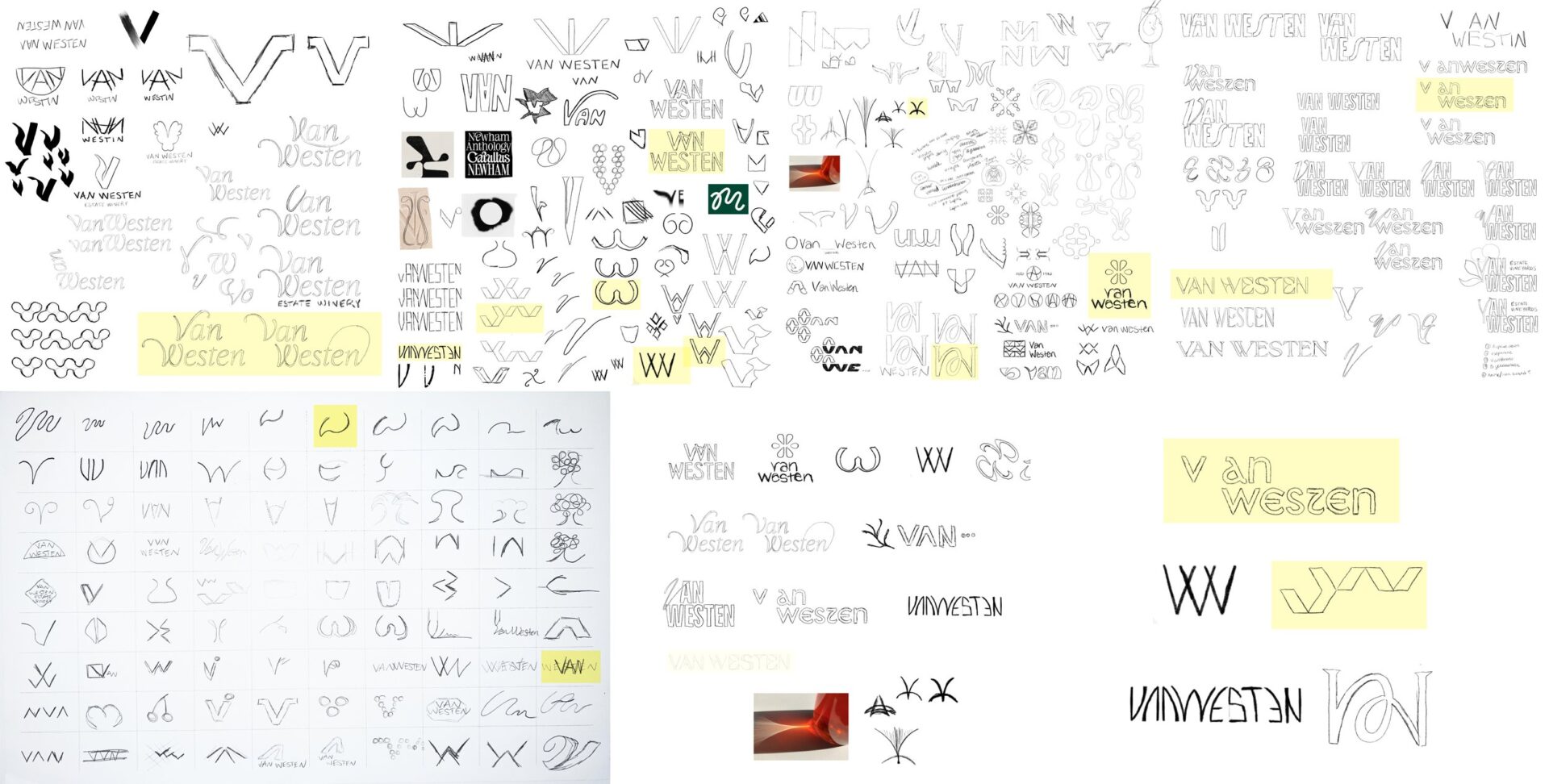
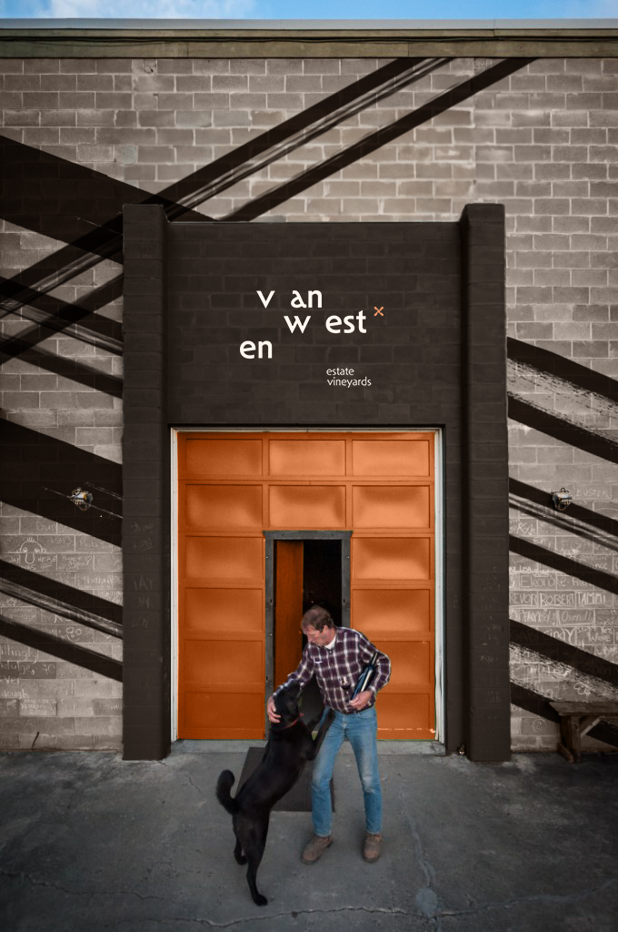
The challenge for this project was to “stand out in the luxurious space in BC’s wine market for a humble winery.” Cali analyzed the current brand identity of her client and explored a new branding perspective with graphics to support the business.
“Van Westen Estate Vineyards, rooted in over 50 years of family tradition on the Naramata Bench, has evolved from being the largest cherry producers in the area into crafting exceptional wines in British Columbia, Canada. The quality speaks for itself, earning themselves numerous awards and selling out effortlessly. Recognizing the charm inherent in their upfront and casual nature, the brand strategy needed a shift – maintaining their rugged authenticity but with an elevated touch.”
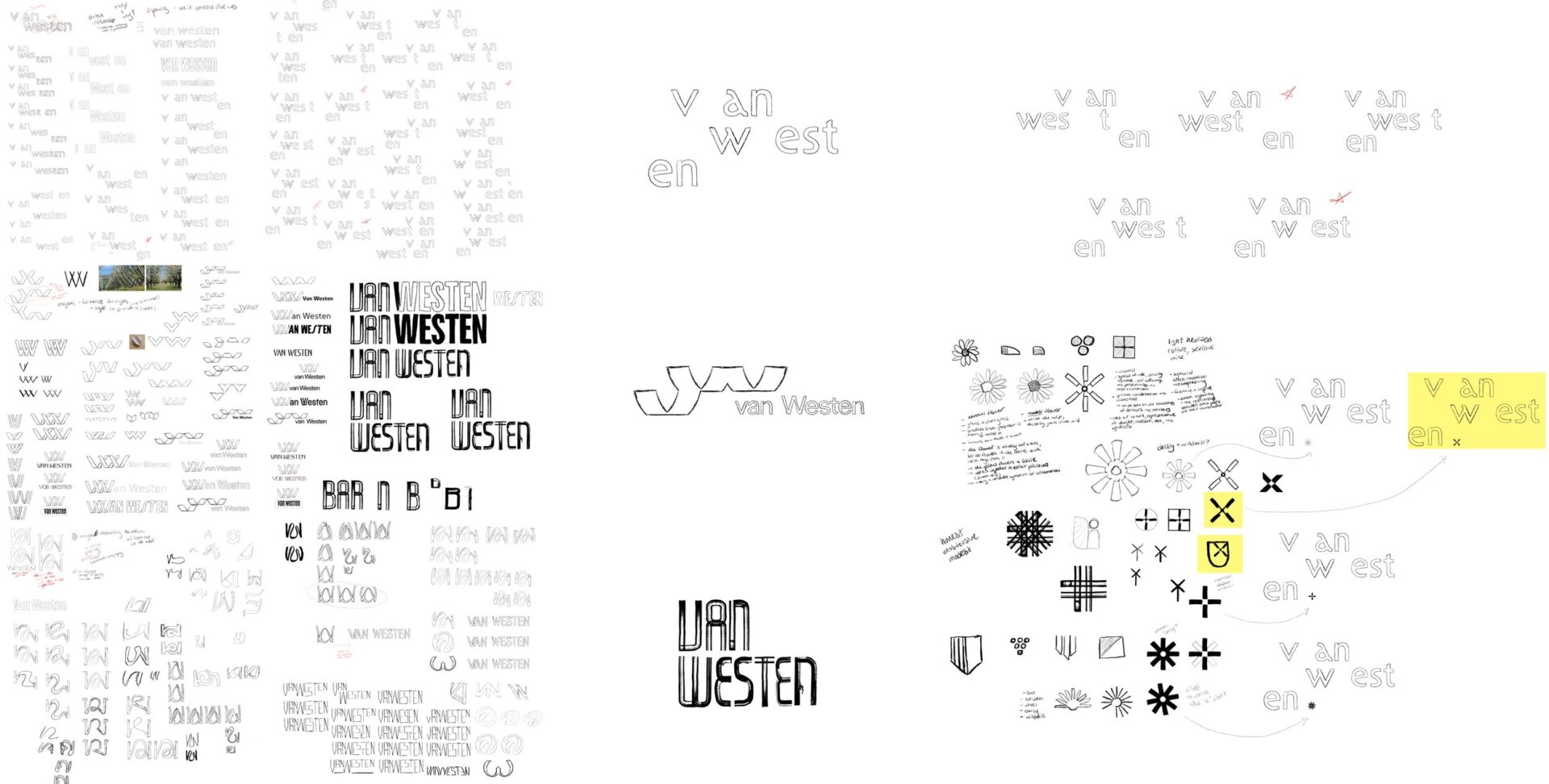
Trusting my instincts played a big role throughout this identity creation phase. When my intuition signalled that something wasn’t quite aligned, I knew I had to listen and keep pushing through. By continuously persisting, experimenting, and exploring new avenues, I would break through with an identity that was strategically strong.

RECOGNITION:
SILVER AWARD 2024
Category:
Student Concepts
Sub-Category:
Student conceptual work – Luxury goods
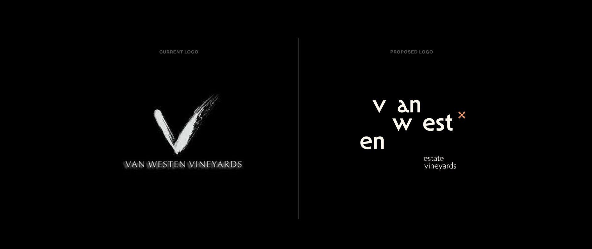
After three weeks of exploration, Cali explored a variety of new logo options. Her solution: “Staying true to our roots and celebrating heritage.”
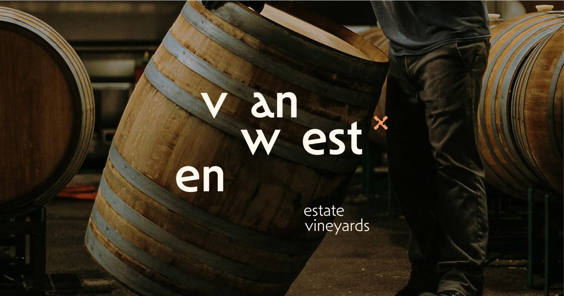
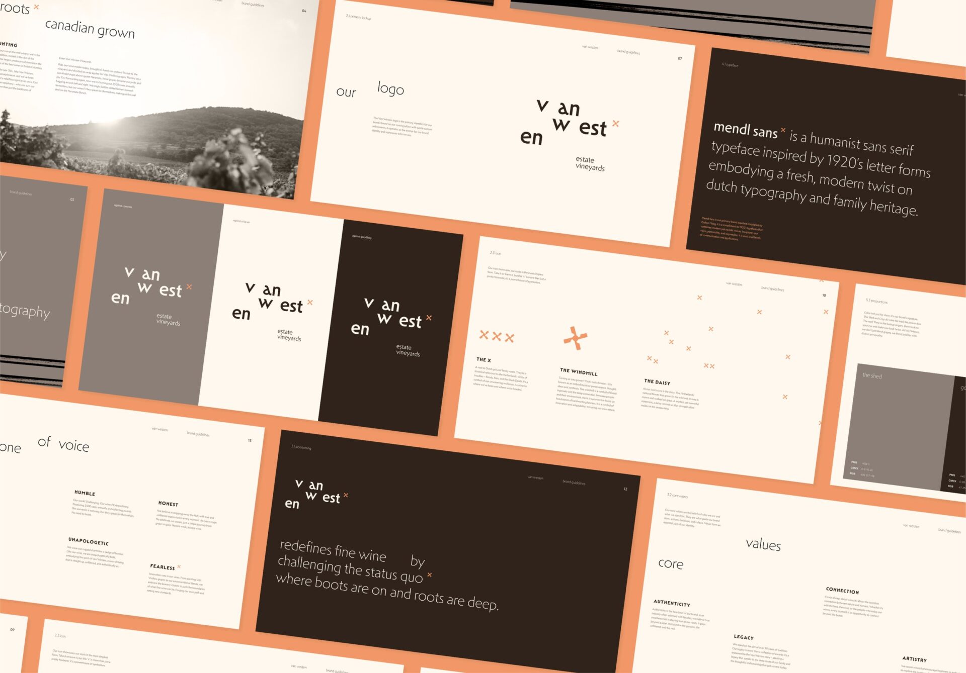
“Celebrating their roots, the Van Westen identity embraces modern hints to Dutch typography with nuanced letterforms, as a subtle rebellion against conventional luxury. The deliberate separation of letters entices a second look, prompting curiosity about the family name.
Notably, the ‘V’ of ‘Van’ becomes a symbolic bridge to their iconic wine-naming structure, highlighting their commitment to doing things differently. ‘Van,’ echoes its Dutch meaning of ‘from’ or ‘of,’ rooting the family’s journey from fruit farmers to award-winning winemakers in British Columbia. ‘West’ is a nod to their migration from the Netherlands to the Canadian west coast. This intersection of heritage and landscape mirrors the exceptional qualities of their wine – A blend of tradition and innovation, grounded in the landscape of the Namarata Bench.
The “daisymill” icon featured is a reference back to Dutch windmills, embodying resilience and innovation with the daisy at its core as Netherlands’ national flower, speaking to strength in the unassuming – a fitting symbol for a winery that thrives on the unexpected intersections of humility and the pursuit of becoming an award-winning winery in the heart of BC’s wine country.”

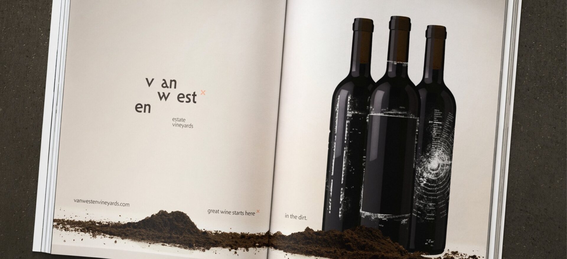
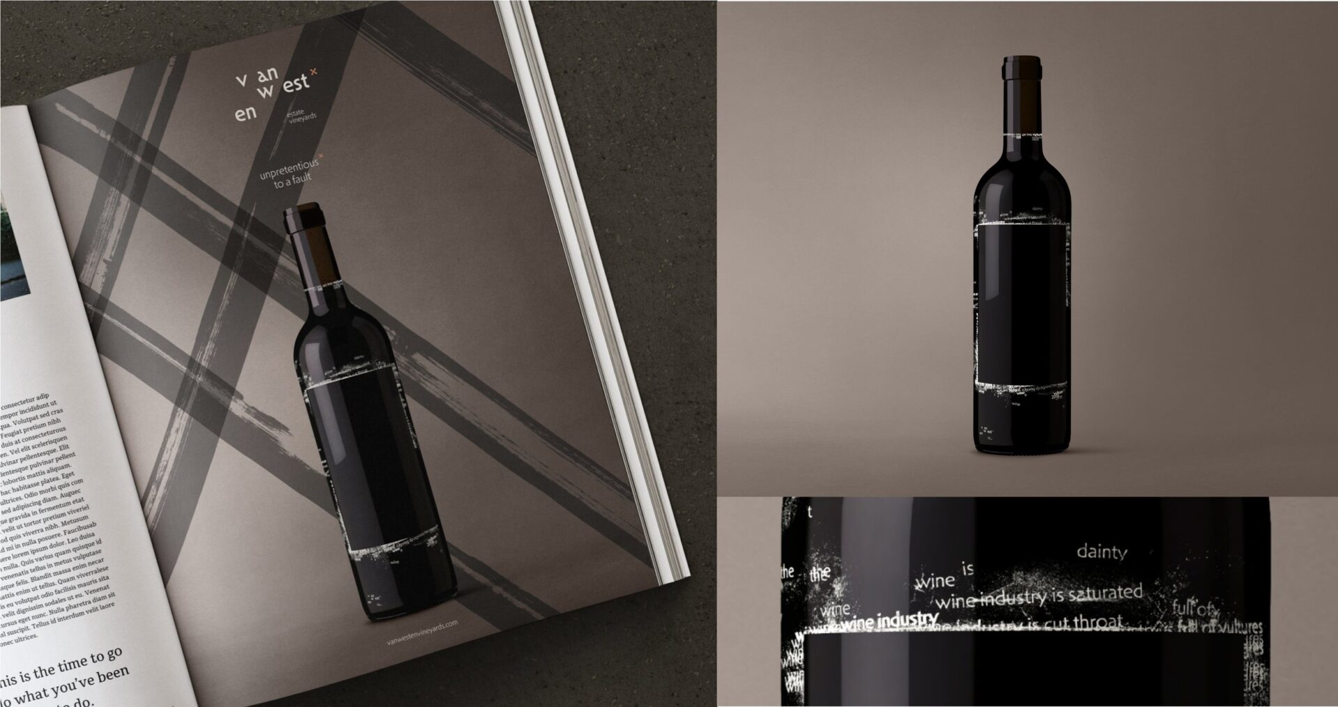
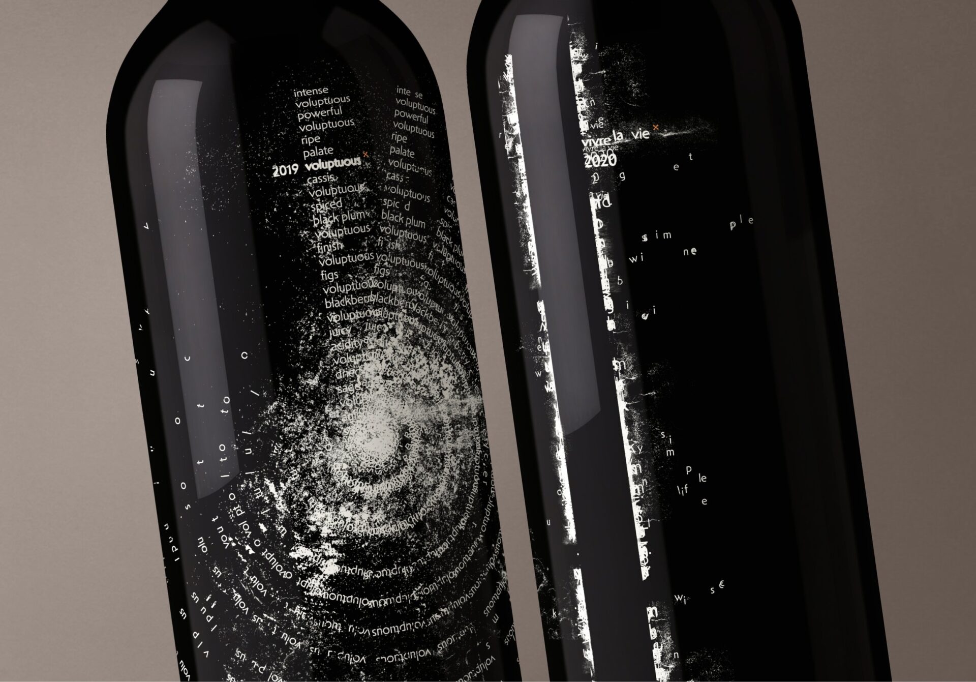
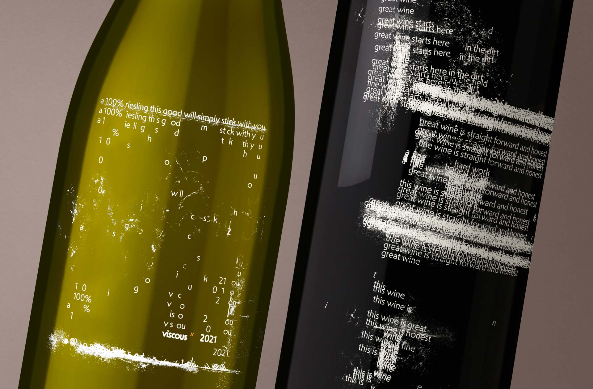
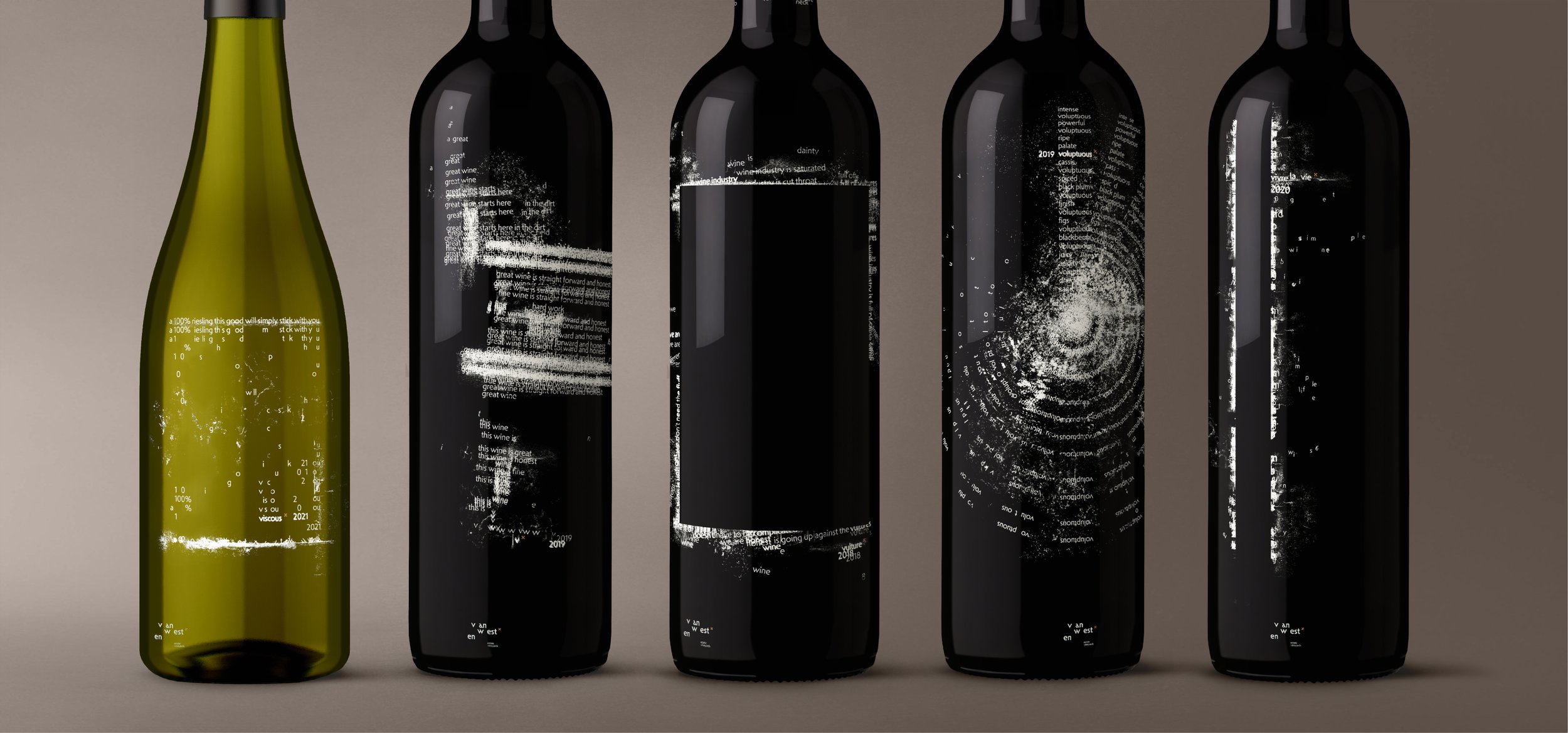
Continuing to the brands packaging, inspired by each wine blend, Cali turned each bottle into a statement piece.
“The Van Westen packaging family is a celebration of the winery’s roots with a rebellious spirit against conventional luxury. Embracing modern Dutch typography with deliberately spaced letterforms, the design system lends itself to enticing a second look and kindling curiosity to dig deeper.
Each Van Westen label displays a unique composition that combines typography, rhythm and art. The compositions take inspiration from the essence of each blend, creating labels worth taking a closer look at. Their commitment to an unfiltered journey from grape to glass strips away the fluff, resulting in bottles that are a statement piece of their own.
Crafting premium wines without the need for boastful claims, Van Westen has repositioned themselves from a once $35 bottle to a $55 bottle, embodying a confident, premium identity.”
Cali attended the 2024 Pentawards Gala Ceremony in London in late October to accept her award. Congratulations again Cali, we can’t wait to see what you create next!
See more of Cali’s work on her website here.
