Julianne
Herbert
Capable of aligning graphic elements with the power of suggestion.
Website InstagramThe Coven
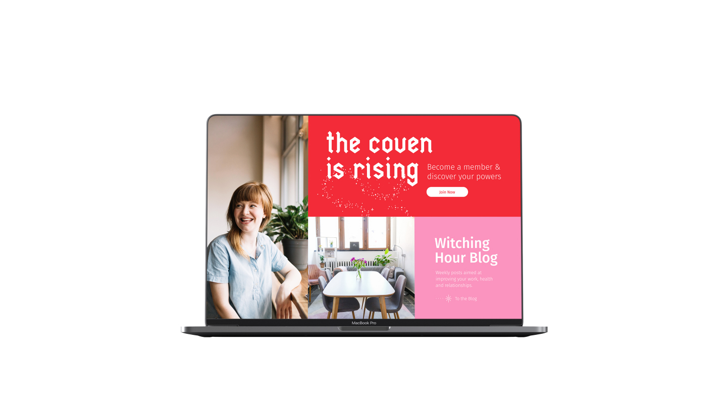
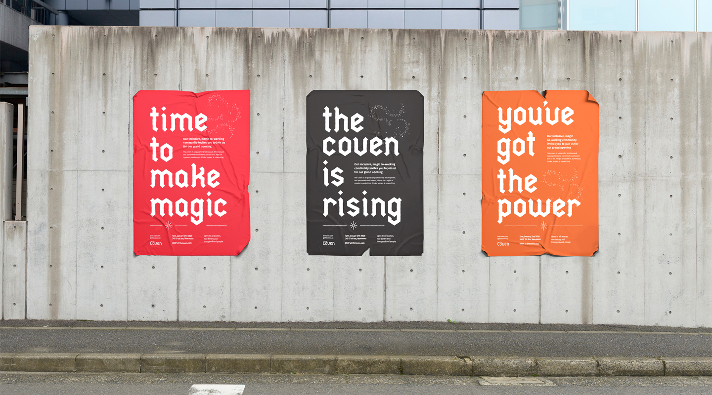
The Coven is a co-working space for women and members of the LGBTQ+ community to pursue growth and make magic through connection, collaboration and content. The space provides a safe work environment that allows members to gain skills, network, and have their voices heard in a way that may not be available to them in the traditional workplace.
The final brand identity for The Coven is geometric in nature and has an edge and toughness that may not be expected of an all-female workplace. The Coven’s brand colours are warm and bright, but have a palpable tension. In order to appeal to the target audience, The Coven’s tone needed to be accepting, empowering, but also cheeky and playful.
Insight
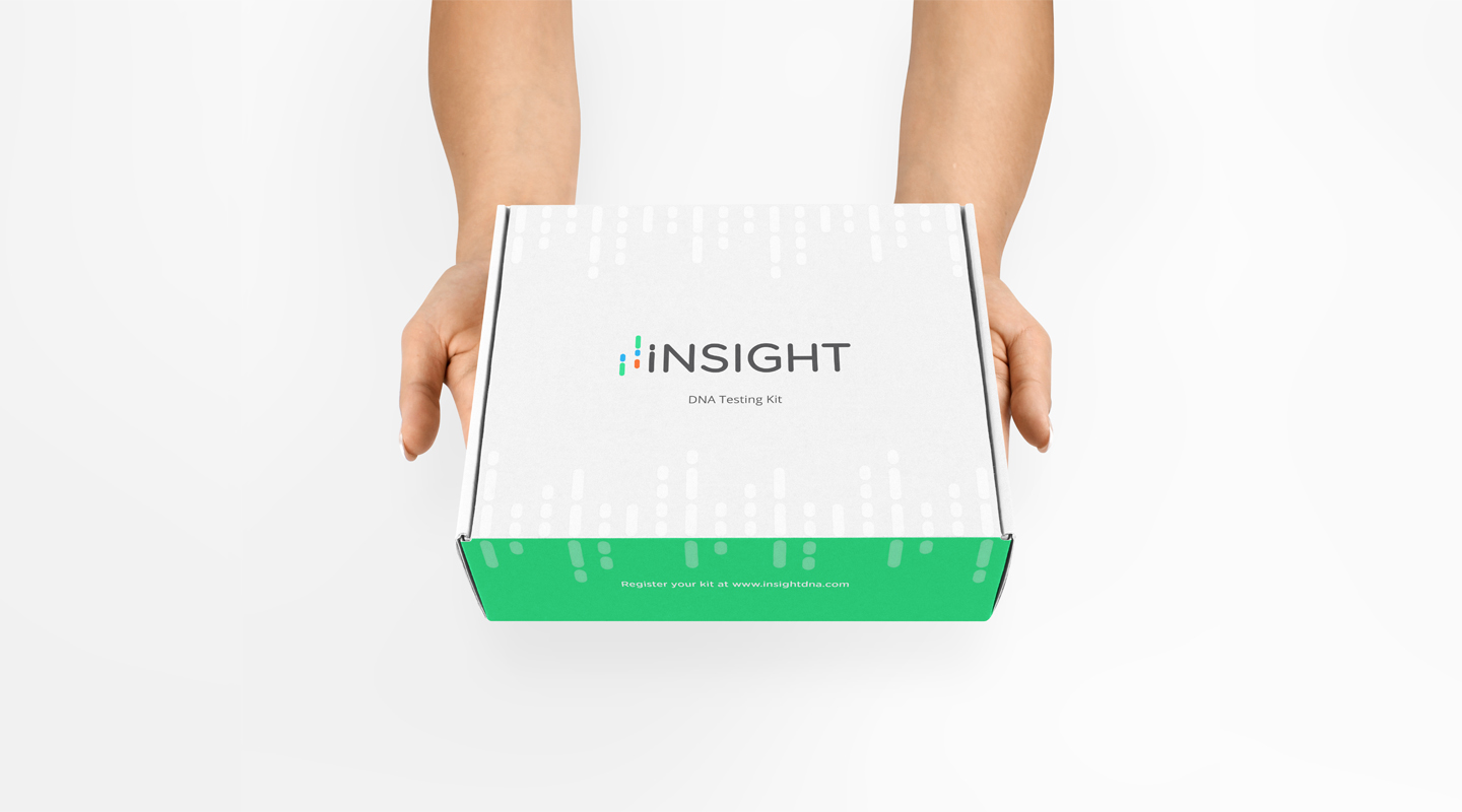
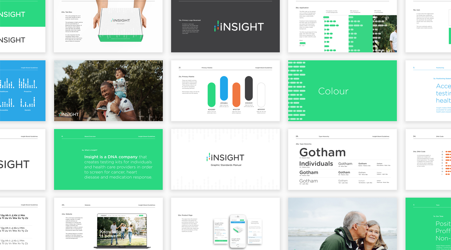
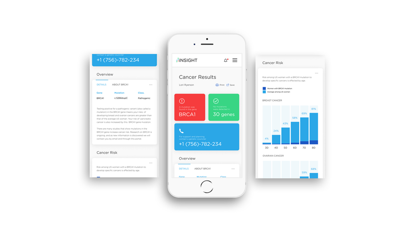
Insight is a rebrand project of Color, a health technology company which provides genetic testing and analysis directly to patients. Color’s rebrand needed to express the company’s mission of making DNA testing more accessible for health planning and foster a sense of trust and security among its target audience.
The name Insight was chosen as the company gives patients the opportunity to gain insight into their genetic makeup. Insight’s new identity represents their goal for open, accessible genetic testing, while remaining friendly and approachable. The chromosomes leading into the wordmark suggest genetic issues coming into sight and can be used as a graphic element. The sans serif type and colour use add an element of lightheartedness. This project was challenging as it required the development of a complete brand guideline that had to then be applied across all the deliverables.
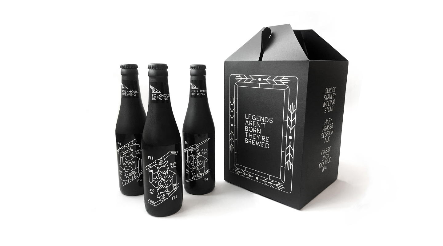
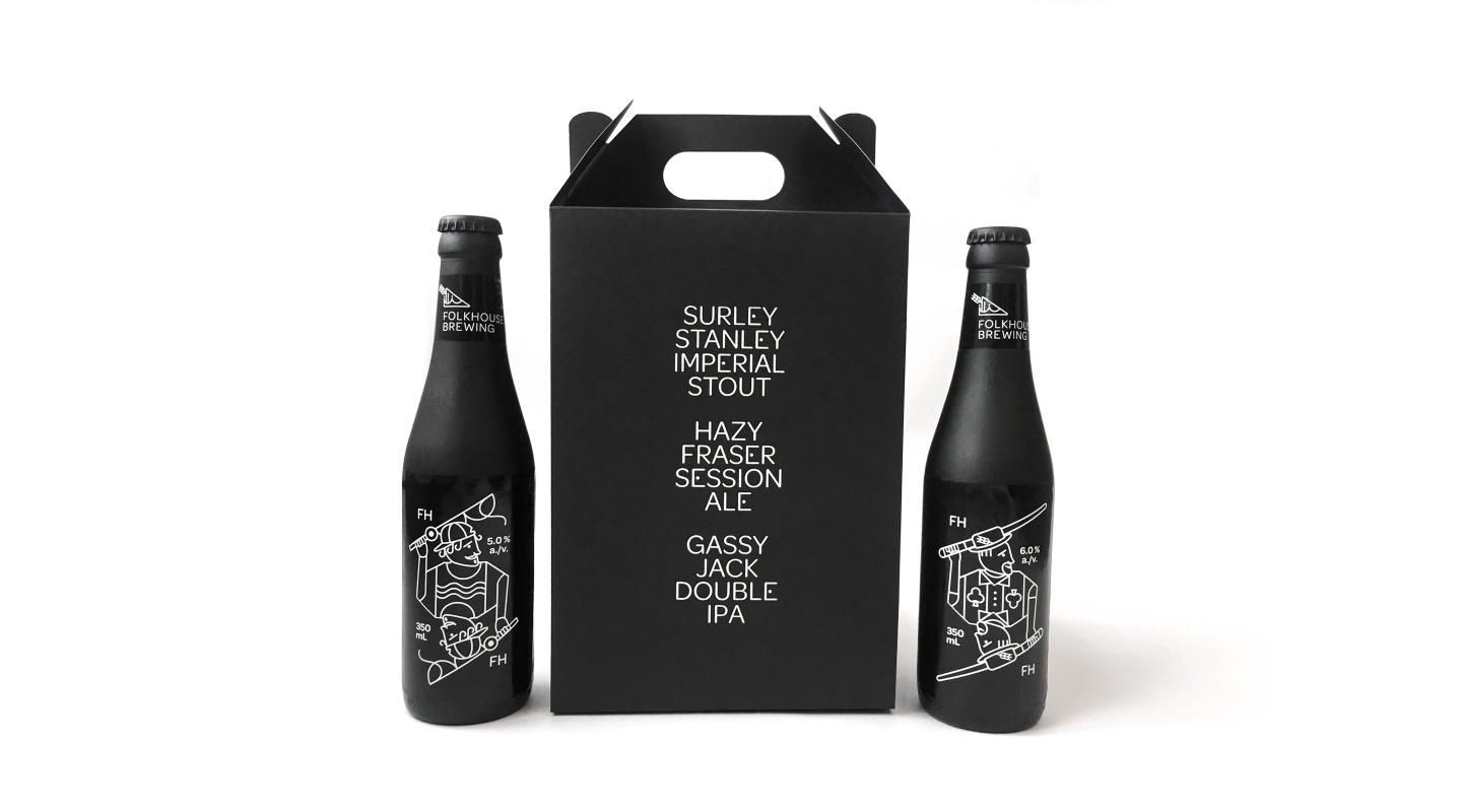
Folkhouse
Folkhouse Brewery is a beer brand that focuses on the concept of legends. People (and beers) become legends through process, struggle and overcoming obstacles and Folkhouse portrays these legends on their beer labels.
The Founding Fathers Beer Series is a modern interpretation of Vancouver’s founding members, Sir Stanley, Simon Fraser and Gassy Jack, as they get together for an afternoon brew and gab. Each beer label is illustrated like a playing card but with a modern twist that embodies the character and style of each beer. The beer carrier can be thought of as the package for this deck of cards and was created by engraving card stock with a laser cutter.
Recognition
Packaging Design Winner – 2019 Applied Arts Student Award
Graphic Design Bronze Award – 2019 ADCC Student Competition