Sarah
Kraft
Applies sub-conscious intuition to design perfect user interface.
Website InstagramStaywell
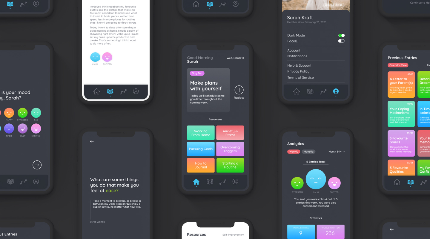
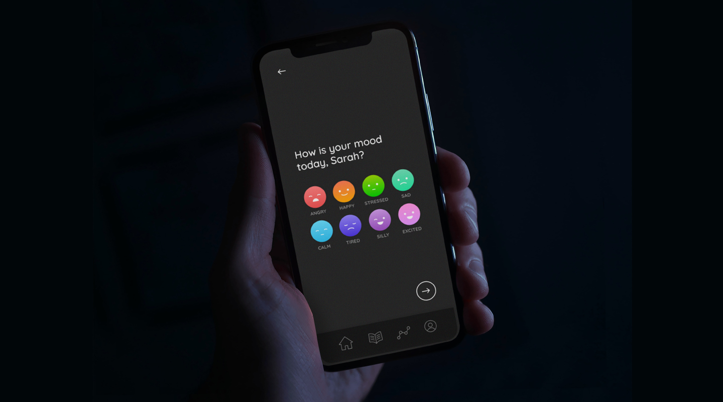
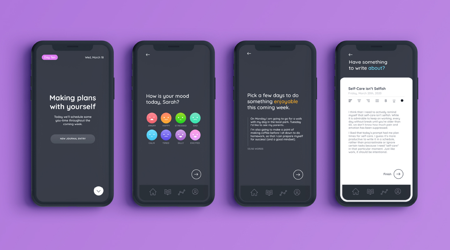
A mental health journaling app that not only tracks users’ moods and progress, but provides them with engaging and thought-provoking writing prompts.
Each journaling experience is intended to immerse the user. Through a consistent colour scheme and a separated series of questions, the user can focus on them one at a time. Each prompt or journaling session encourages the user to track their mood(s), complete an activity or two related to the prompt, and jot down a word or two about their day. The coloured gradients reappear as both a background colour and in the representations of each moodlet. Despite the, at times, heavy and vulnerable topics that the app would hope to work through with its users, Staywell’s goal is to pose itself as an uplifting and trustworthy friend.
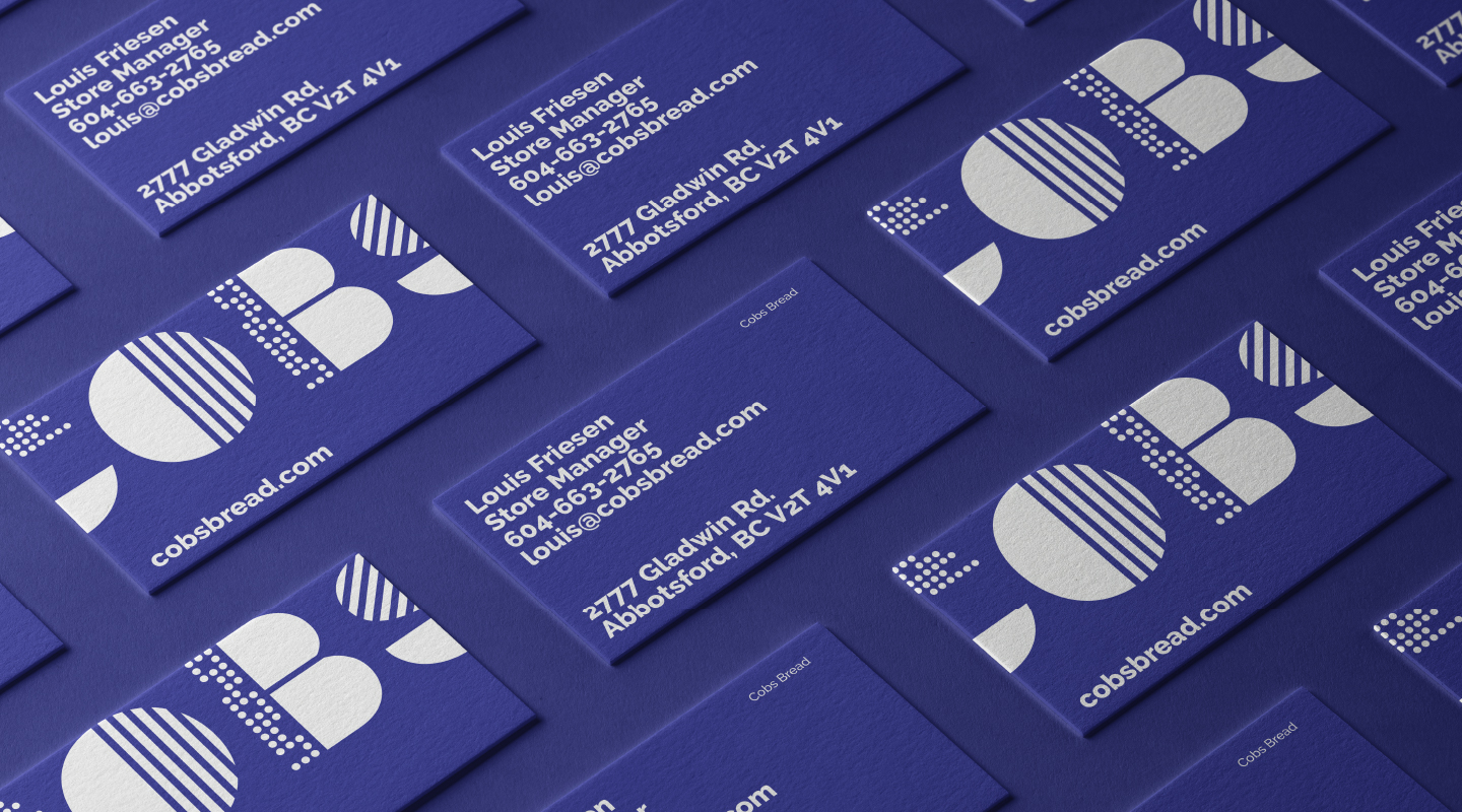
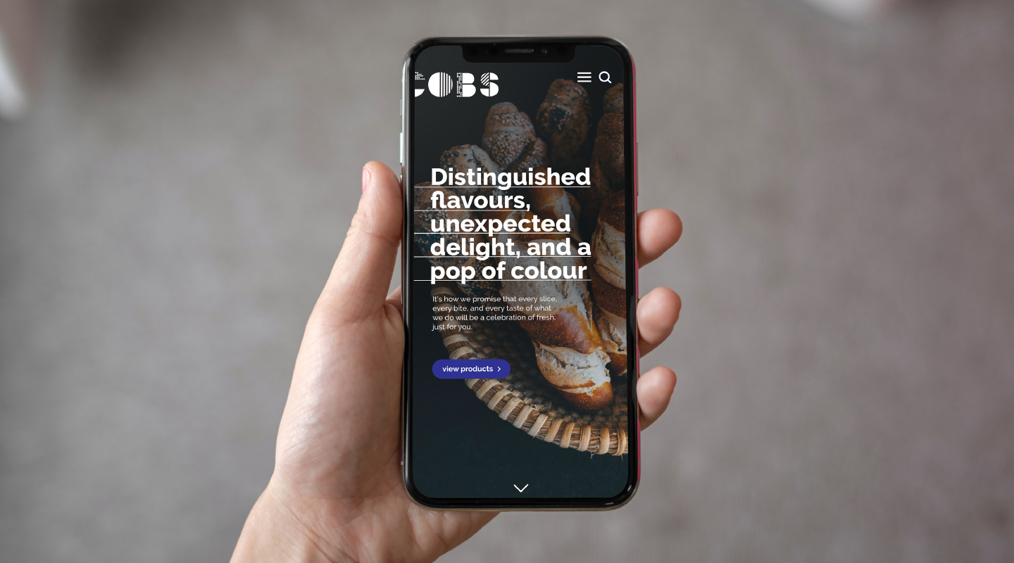
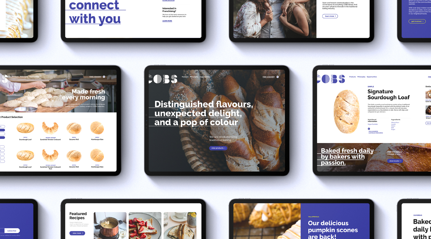
COBS Bread
A rebrand that reinvents the image of an authentic bakery: bringing curiosity, excitement, and innovation to traditional recipes and sharing the joy of baking with generations both young and old.
The strategy behind COBS’ rebrand is simply based on their mission. This includes serving quality bread, demonstrating superior service, inspiring friends and families, and igniting passion and curiosity. I chose to introduce graphic elements, textural images, conversational headlines, and bold colours to the visual identity. The new logo is geometric and dynamic, portraying youthfulness and modernity. The patterns within it are meant to represent the texture and flavour of COBS’ product variety while the vibrant colour scheme dramatically distinguishes it from other bakeries.
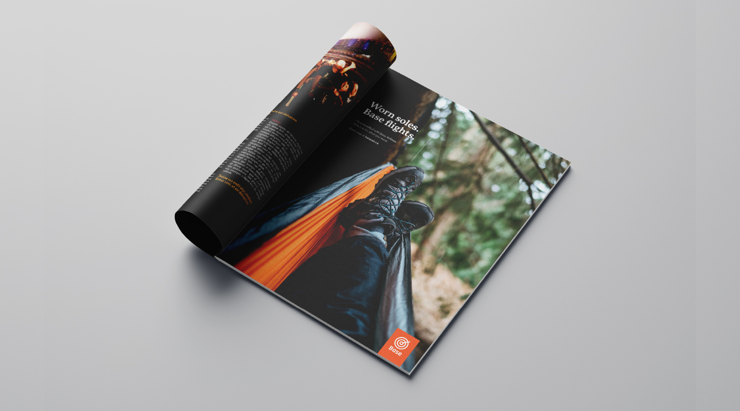
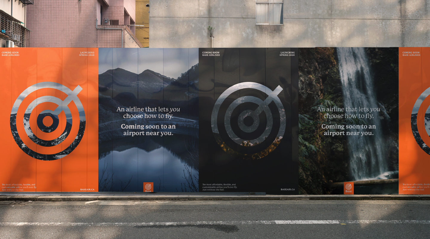
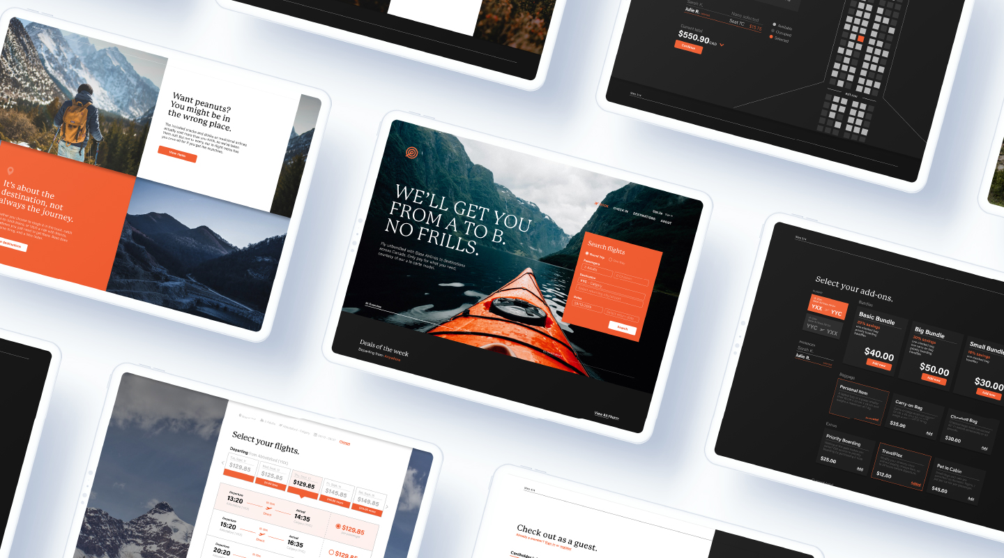
Base Airlines
A rebrand of Flair Airlines that capitalizes on an ultra low cost carrier’s unique, à-la-carte flight booking process.
Base has the opportunity to be humorously upfront about their customizable, low-cost, and imperfect offering toward their audience who, ultimately, just wants to get from point A to point B. The resulting personality for the company was blunt, rugged, efficient, and inspirational. The logo takes the form of a simplified aircraft radar, taking inspiration from military badges, minimalism, and local outdoor equipment & apparel companies. Orange and black were chosen as the brand colours to serve as a contrast to the company’s competitors as well as convey Base’s stark personality.