
Akram Shaban “THE SCALABLE VECTOR”
Much like the design process itself, Akram’s road to graphic design was a messy sequence of intertwined paths that ultimately converged to the right destination. His first exposure to design was when he torrented a copy of Macromedia Flash 8 back in 6th grade to make cool stick figure animations. Tinkering around with design software was always a fun hobby for Akram, but he didn’t know that it could be a realistic career path. In school Akram enjoyed learning about world history and thinking critically about the various issues of society. Akram was also motivated by his lived experience as a third generation Palestinian refugee. He remembers a time when even mentioning such a fact might get him in trouble. So, along with a passion for writing, Akram pursued a degree in political science at KPU. However, after 2 years he wasn’t fully confident that he could do the type of work that mattered to him. The design tinkerer in him wanted to help out too. That’s when he realized that merging those two interests would help reach his full potential.
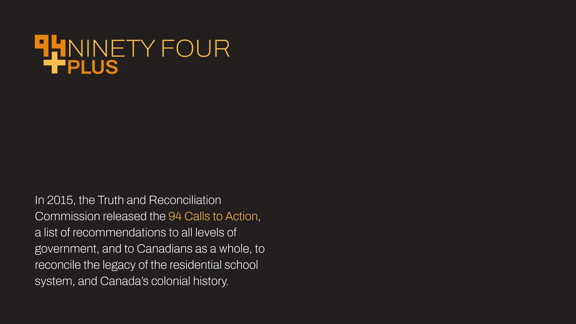
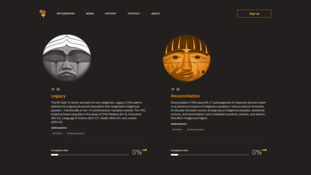
01BRANDING 94+ is an interactive web tracker that monitors action on the Truth and Reconciliation’s 94 Calls to Action. Features of the website include infographics, survivor stories, annual reports, and educational material. The purpose of tracking action is to hold those responsible accountable, and to help engage the general public on a relatively complex and intimidating subject. The name 94+ is recognition of the fact that the implications of the CTAs goes far beyond simply ticking boxes. The plus also symbolizes Canadians coming together to fulfill their responsibilities as settlers on indigenous land.
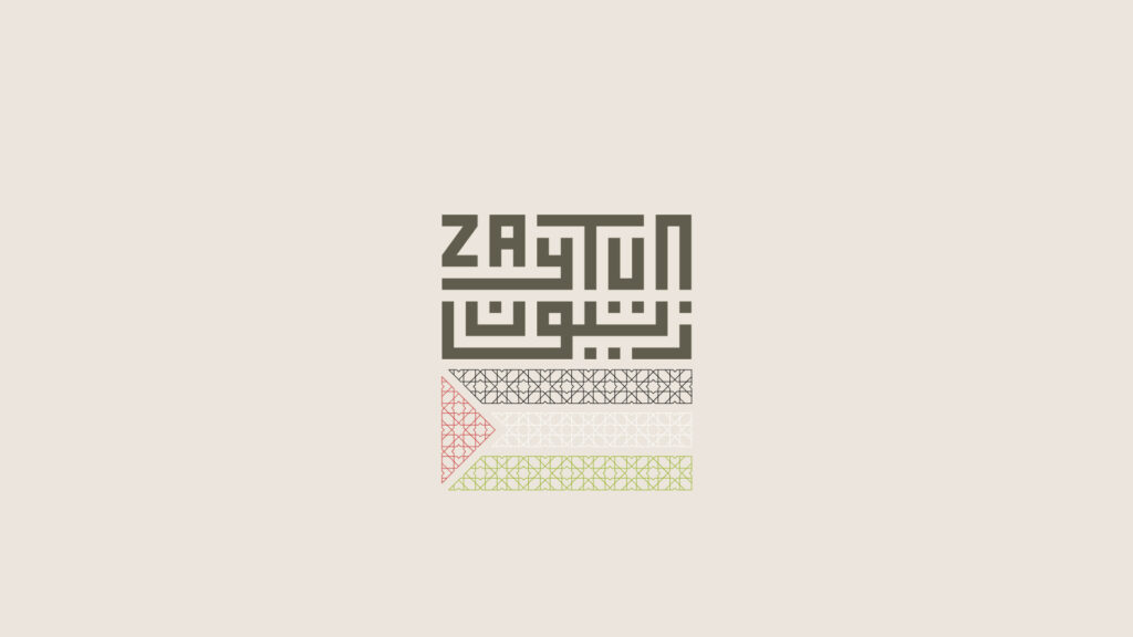
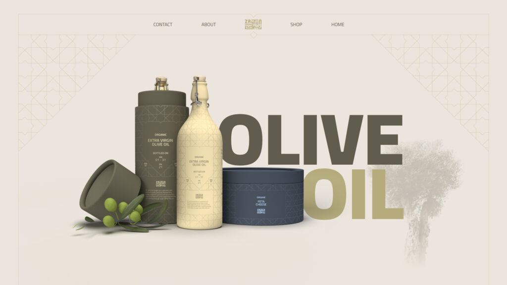
02BRANDING + Packaging Zaytun is a branding and packaging concept for a Palestinian olive oil maker. Zaytun is the Arabic word for olive. The logo is inspired by traditional Arabic calligraphy, and both languages are rendered together to form a singular entity. The package is inspired by the Islamic motifs that can be found on architecture such as the Dome of the Rock in Jerusalem. A portion of the proceeds of sales goes to supporting farmers in the West Bank who suffer from a military occupation that continually undermines their livelihoods.
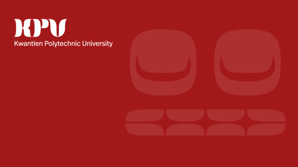
03BRANDING The inspiration for this logo was leveraging the unique connection between KPU and the Kwantlen First Nation. There is a real opportunity to celebrate this privilege by incorporating indigenous design. The most challenging aspect of this redesign was not creating the mark, but rather navigating the sensitive issue surrounding the appropriation of indegnous art. Rather than turning away from such a challenge, Akram was encouraged to explore that matter further, and to consult indigenous leaders in the community for guidance.