

Amanda Perley “The Pitcher”
Having picked up a paper and pencil by the age of two, Amanda has always had an eye for all things creative. Upon realizing her passion for editorial and branding design, there was no looking back. Competing in local softball leagues for nearly two decades has equipped her with leadership intel, teamwork know-how, and a competitive spirit. Amanda aims to claim her place in the industry through precise, thoughtful, and striking design.
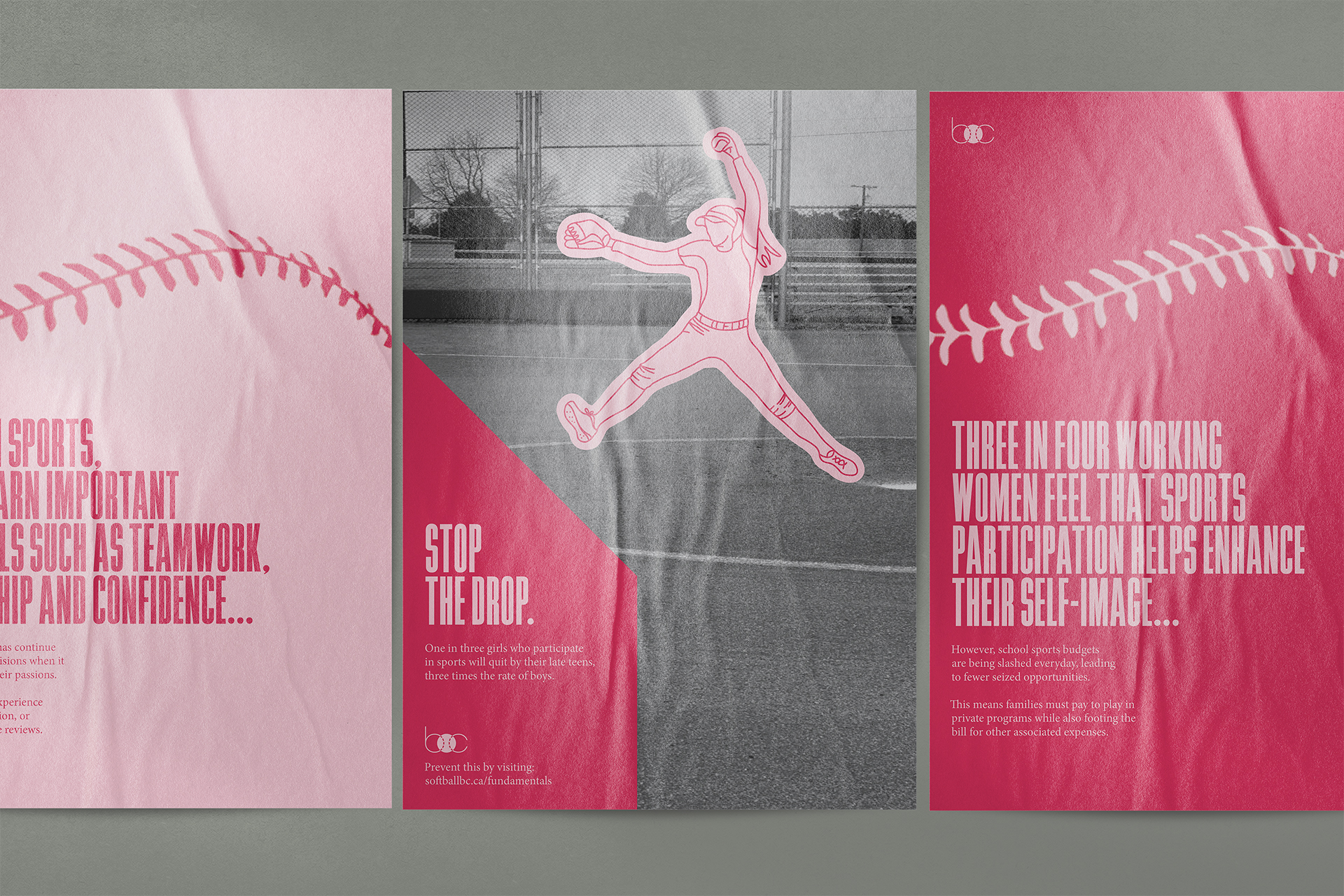
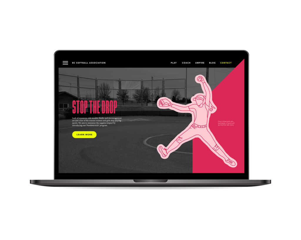
01Branding, CampaignSoftball BC seeks to build a fun, fair and safe environment for all participants to enjoy the game at any level. As part of their strategic plan, they aim to increase membership and development through social and tactile means. Softball BC must garner meaningful attention and interest in order to achieve this.
‘Stop the drop’ is meant to bring awareness to all the reasons girls, coaches, and umpires might give up participating in softball. Having been a member of Softball BC for the past 18 years, I have a deep personal connection with the subject matter – from the point of view of a player and an umpire. These issues are very real and can severely impact participation and enjoyment of the sport. Softball is all about teamwork and connection, without it no one would be able to pursue their love of the game.
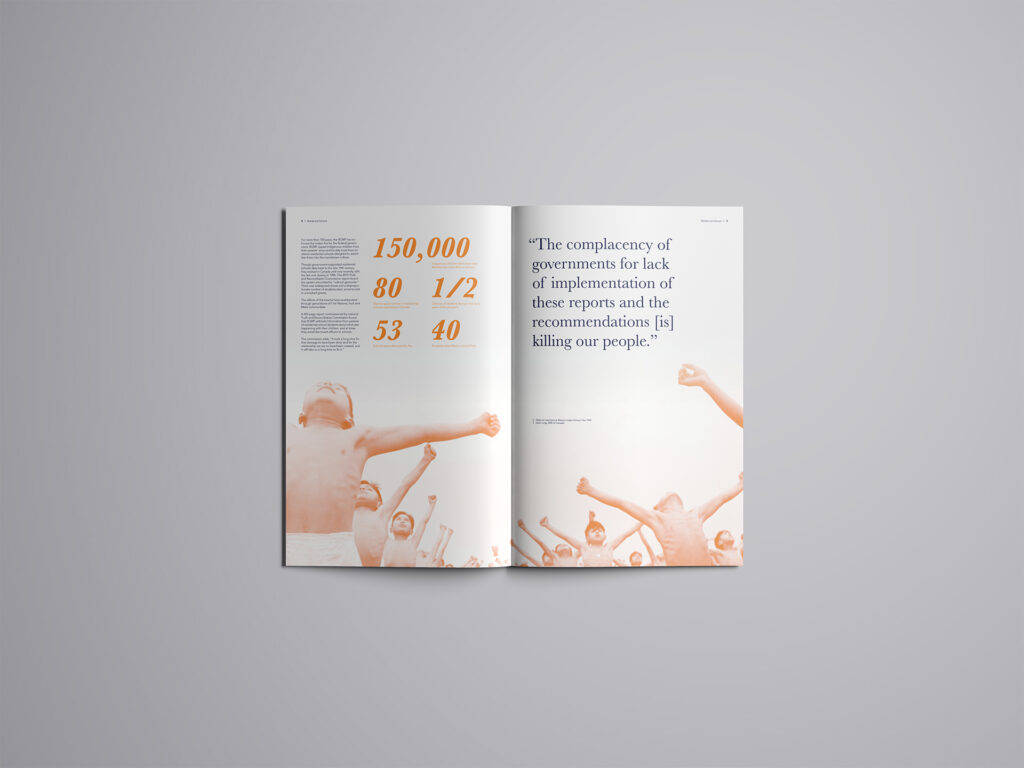
02Print, Infographic‘The Devil in Disguise’ is a curated infographic booklet that highlights the strained history and relationship between the RCMP and Indigenous communities across Canada. Stemming from the creation and implementation of Residential Schools this turmoil spills into the present. This project is meant to serve an educational tool that opens up the floor for communication and reconciliation.
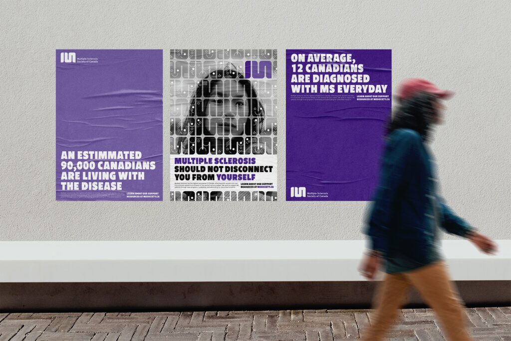
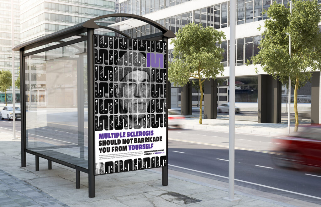
03CampaignThe Multiple Sclerosis Society of Canada provides services to people with multiple sclerosis and their families and funds research to find the cause and cure for this disease. Their main goal is to receive as much financial support as possible in order to conduct the research necessary in finding a cure. Differentiation brings a unique sense of purpose to any brand, especially for those that require funding and donations. The MS Society needs to stand out to achieve this.
‘Faces of MS’ is directed towards those that have been diagnosed with MS or have been affected indirectly. As someone who has a familial tie to MS, awareness and understanding are the first steps in gaining support from those with no direct connection to the cause. This project was inspired by mother, who to this day continues to shine through her MS.
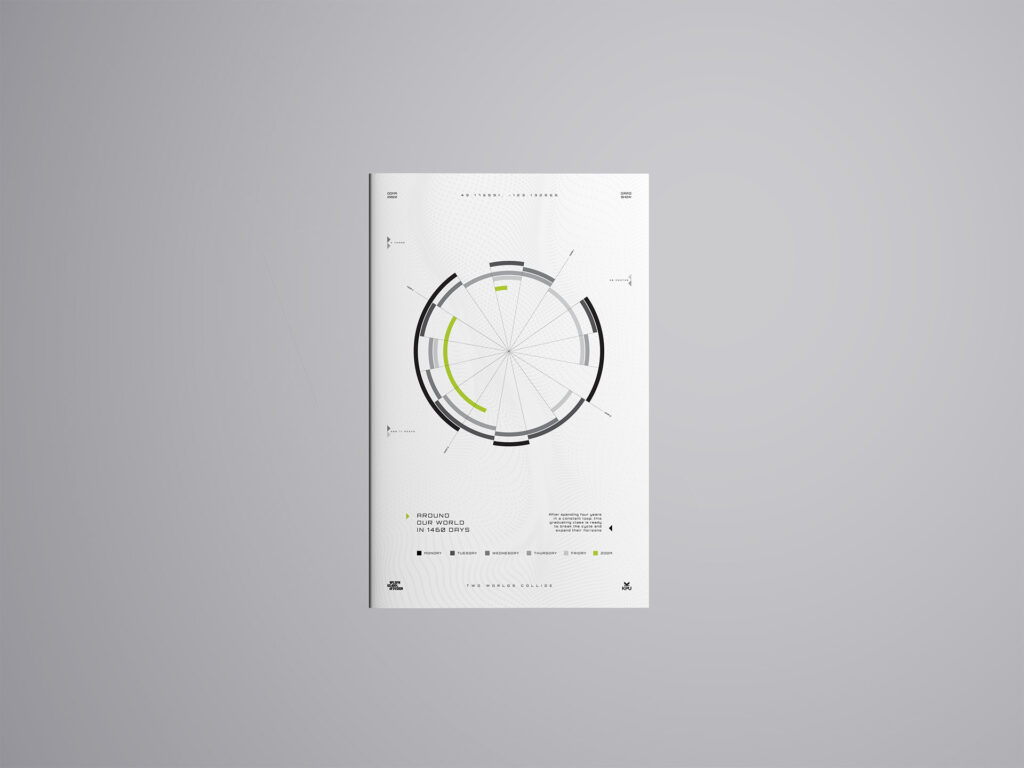
04CampaignAs any design school graduate knows, a grad show can make or break your first impressions on the industry, and creating a successful and cohesive campaign can positively influence this. Summarizing my grad class’ four years together in a creative and unique way is the best way to get our names out there.
“Around our world in 1460 days” articulates our four year schedule and hones in on the amount of time we have spent learning over that time. As we are entering a tech-driven industry, it became clear that using futuristic visuals was the way to go.