Jessica Dziekiewicz “GEOMETRIC JESS”
Through every stage of life, Jessica has put her creative mind to use one way or another and in various forms. She enjoys design as it continues to constantly push her creativity in new ways. Just like her adaptive personality, her design style adapts to each project. When she’s able to do meaningful work with purpose, that’s when her passion for design really shines through. She prides herself in being caring and having perspective, has a love for dogs and pays attention to the little things in life.
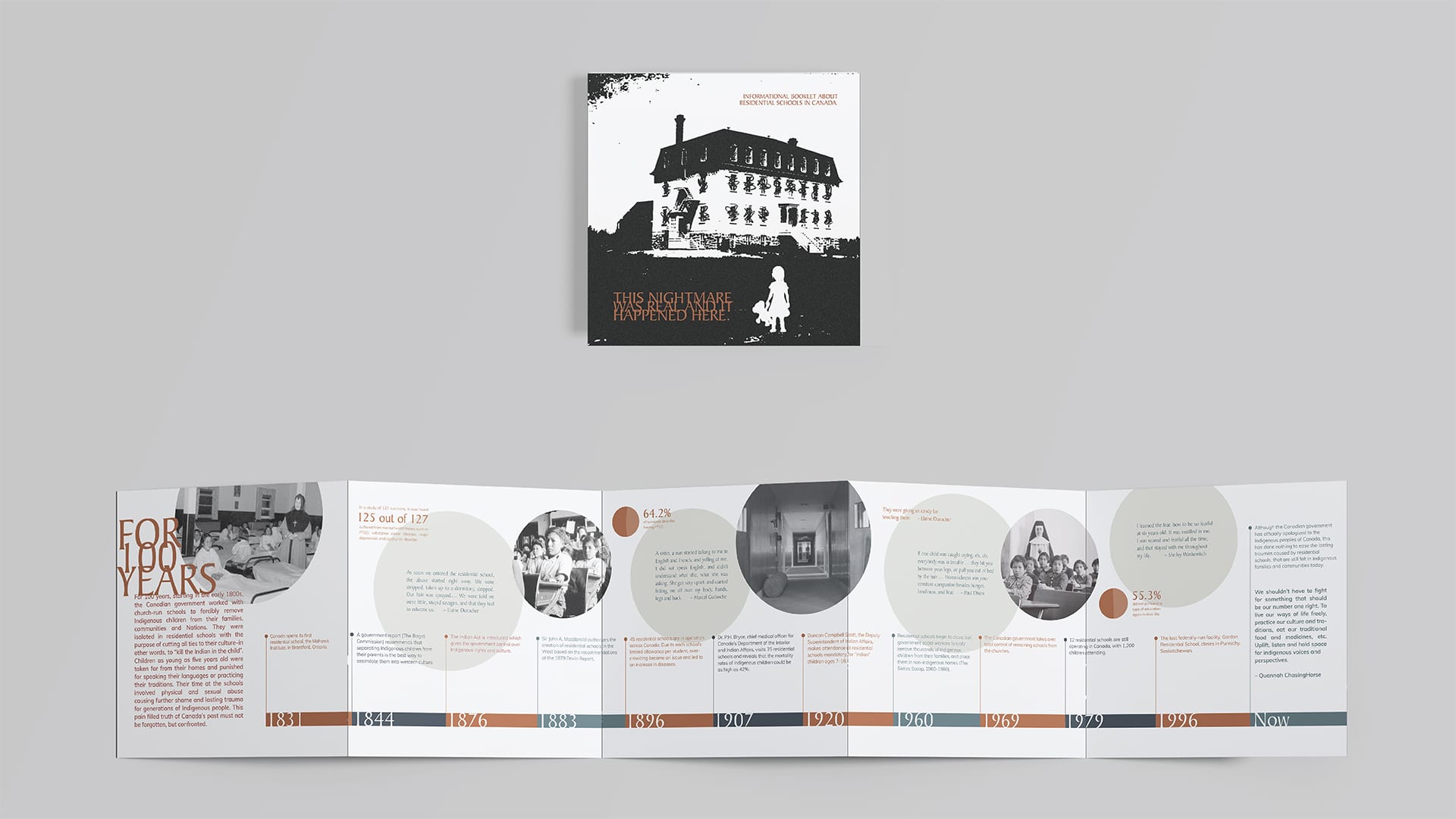
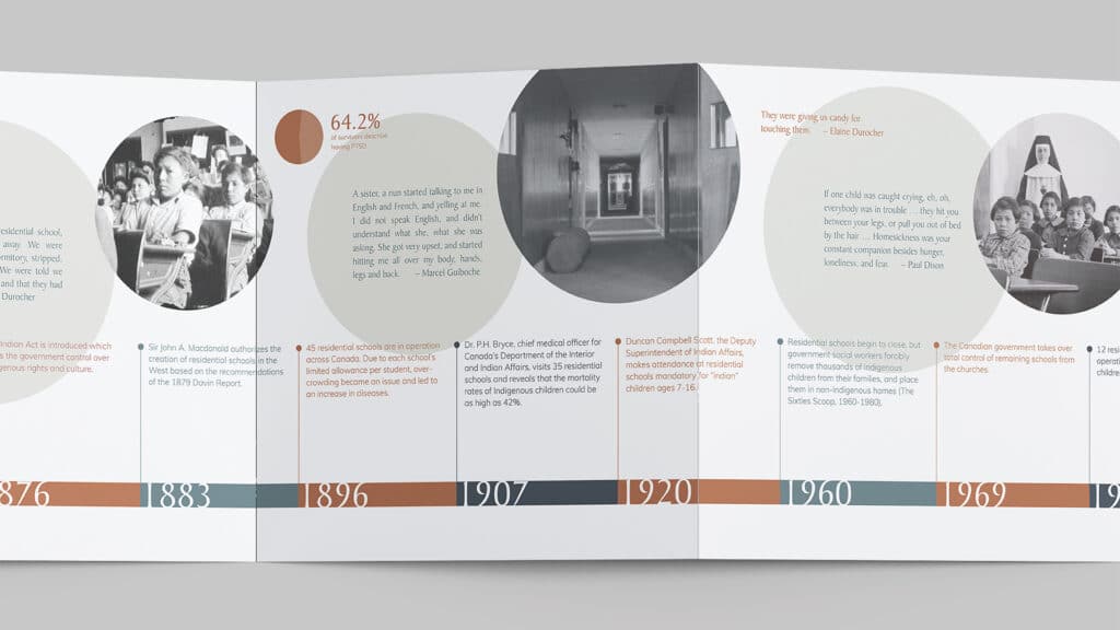
01 Information Design, Print Canada’s dark past entails 165 years of residential schools plus its traumatic effects on Indigenous people are still prominent today. This printed brochure tells a summarized story that includes a timeline, real quotes from survivors and statistics. The cover titled “this nightmare was real and it happened here” is meant to draw the audience in with an ominous feeling. Meanwhile, the inside utilizes a sophisticated and concise style of delivering the content so it’s digestible. The information is also broken up into short portions, paced with images and shapes to help with this. This project is meant to emphasize that these stories are real ones endured by real people. It’s meant to be used as an introductory handout resource that is the first step to awareness and education about the topic.
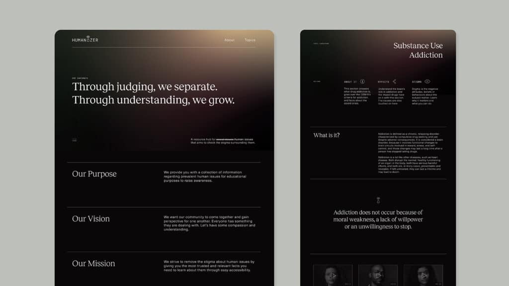
02Website Design, Branding Humanizer is a resource hub for social issues that aims to check the stigma around them by talking about them as the human issues they are. The opportunity for this project lies in the lack of accessibility for accurate, research based information on tough subject matters. The solution this project delivers is a website full of facts and perspective presented in a polished and modern style. The typography and layout choices are the focus of this design to keep all the content straight to the point without any fluff. The colours used are earthy to connect to the humanness of the project, but dark to touch on how serious the matters are. There is a little bit of light in the gradient to display a possible better future for these issues. The logo includes an icon of a person with an eye as their head to signify having an open mind.
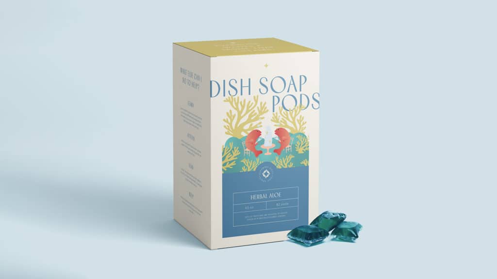
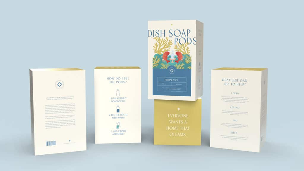
03Package Design, BrandingThis package design is for ocean safe dish soap pods with the only packaging being the recyclable box to reduce plastic waste. Marine pollution is one of the biggest issues facing our waterways today. Tonnes of plastic waste are circulating on ocean currents and breaking down into smaller and smaller particles, often ending up on or inside seabirds, marine mammals and fish. Gleaming gills works towards creating products that reduce plastic waste by eliminating the creation of new plastic containers or wrappers. This brand concept encourages repurposing household items by providing the opportunity to reuse them. The design is made to have a bit of a deluxe feel to it, but also has a side of humour with the illustrated setting of a couple fish in their habitat.
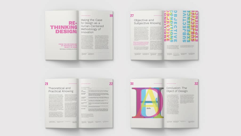
04Publication Design, PrintThis project brought the challenge of designing a long form, type only article into something more consumable based on the themes taken away after reading the original document. The main takeaway I had from the written piece was about how the authors were dissecting an array of ideas surrounding the topic of design that actually end up overlapping in many areas, but also had differences at the same time. The article was also pushing readers to rethink these topics and investigate them further, therefore I wanted to surround my concept around bringing together what we already know and re-molding it into something more progressive. That’s where I played with overlapping the type to use as graphics with bold colours to signify the aspect of something new and bright, yet also calling back to the basics of CMYK as an element.

